Golden State
Valkyries
Project Information
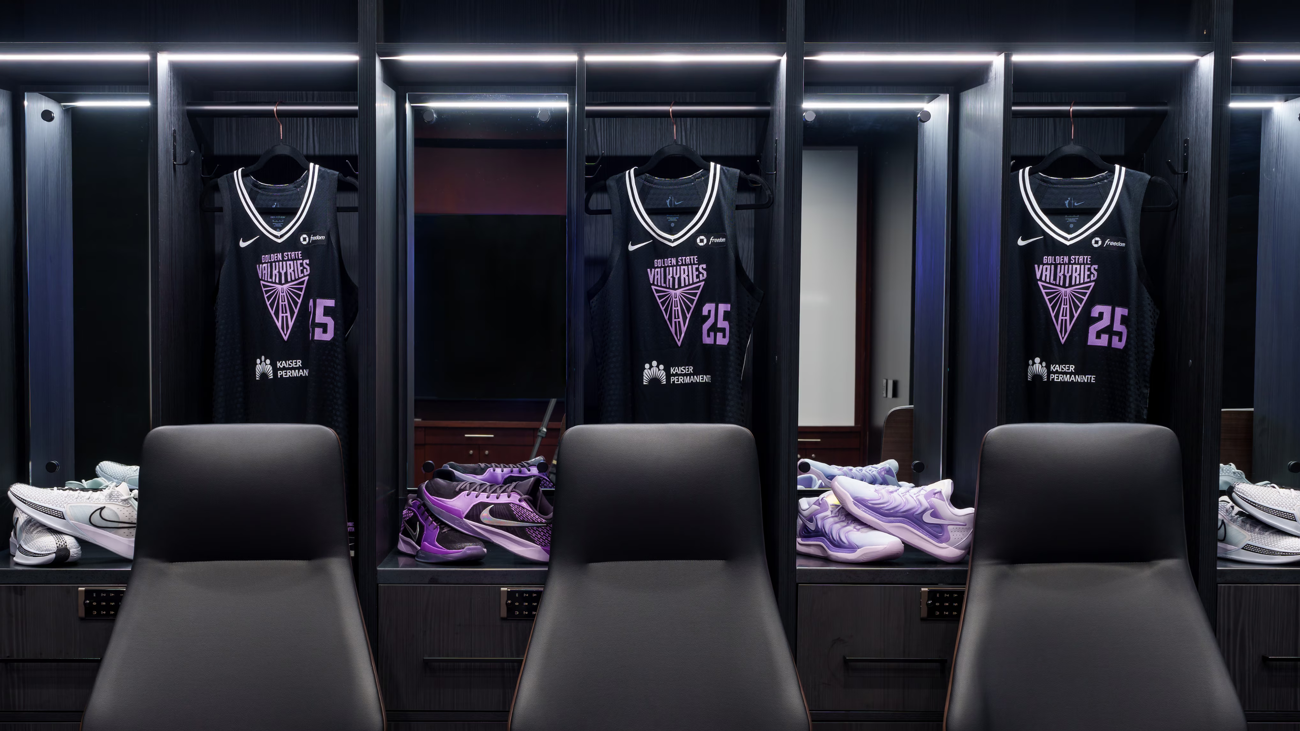
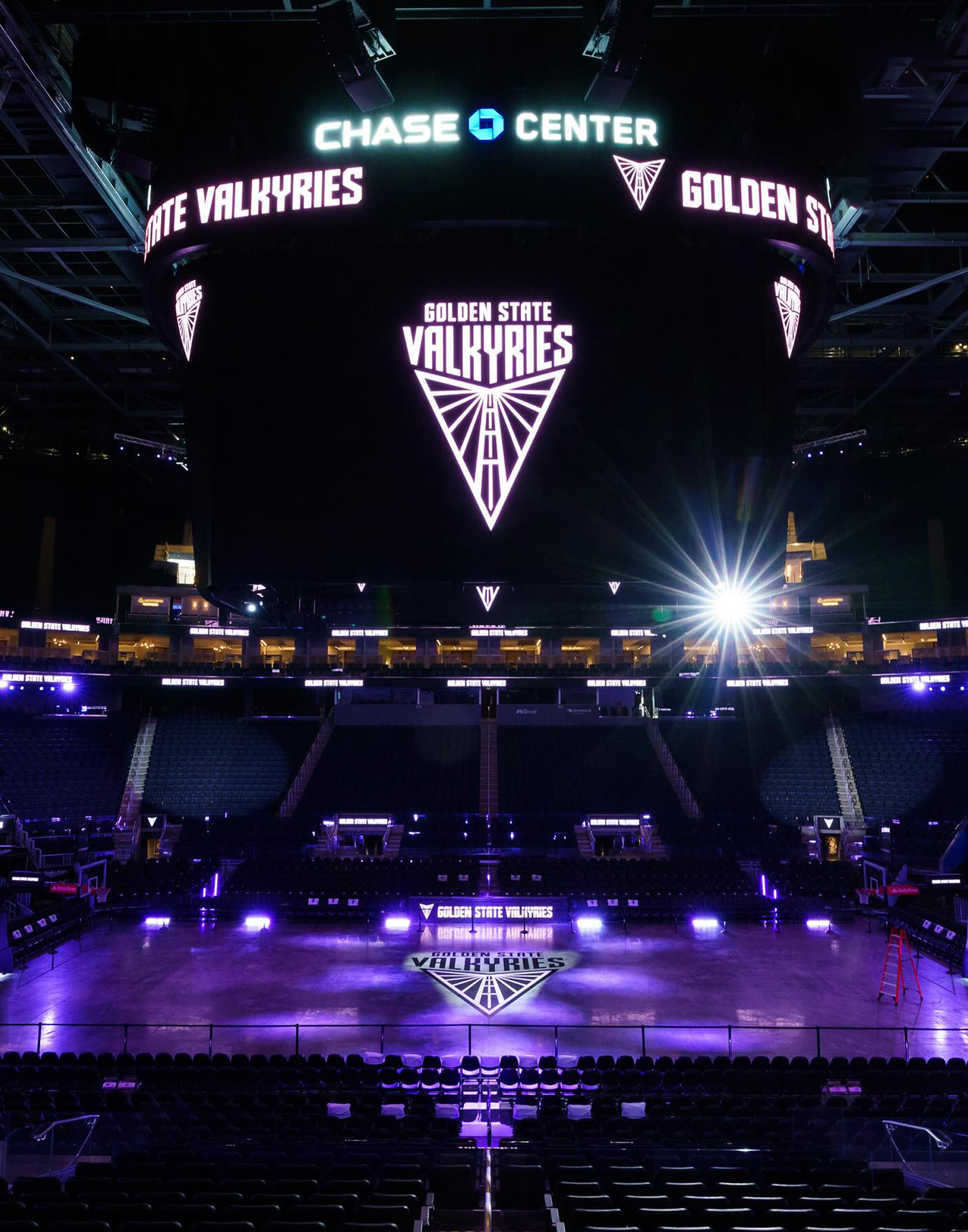
When the WNBA expanded into the Bay Area, the brief wasn’t just to launch a team — it was to manifest a new symbol of female power in a city of bridges and resilience. D&C stepped in as a creative thought partner to articulate how Valkyries could feel both fierce and rooted: a brand that would carry weight in the arena and in the streets. The name “Valkyries” was chosen through public resonance and mythic appeal, positioning the team as warriors of choice, legacy, and empowerment.
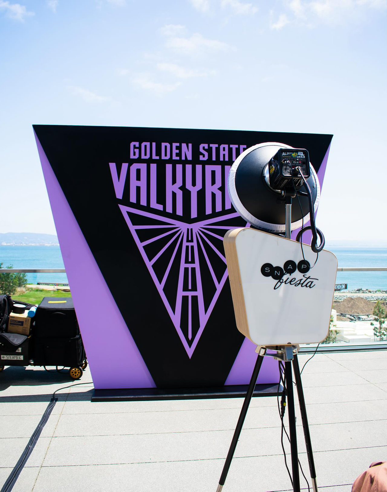
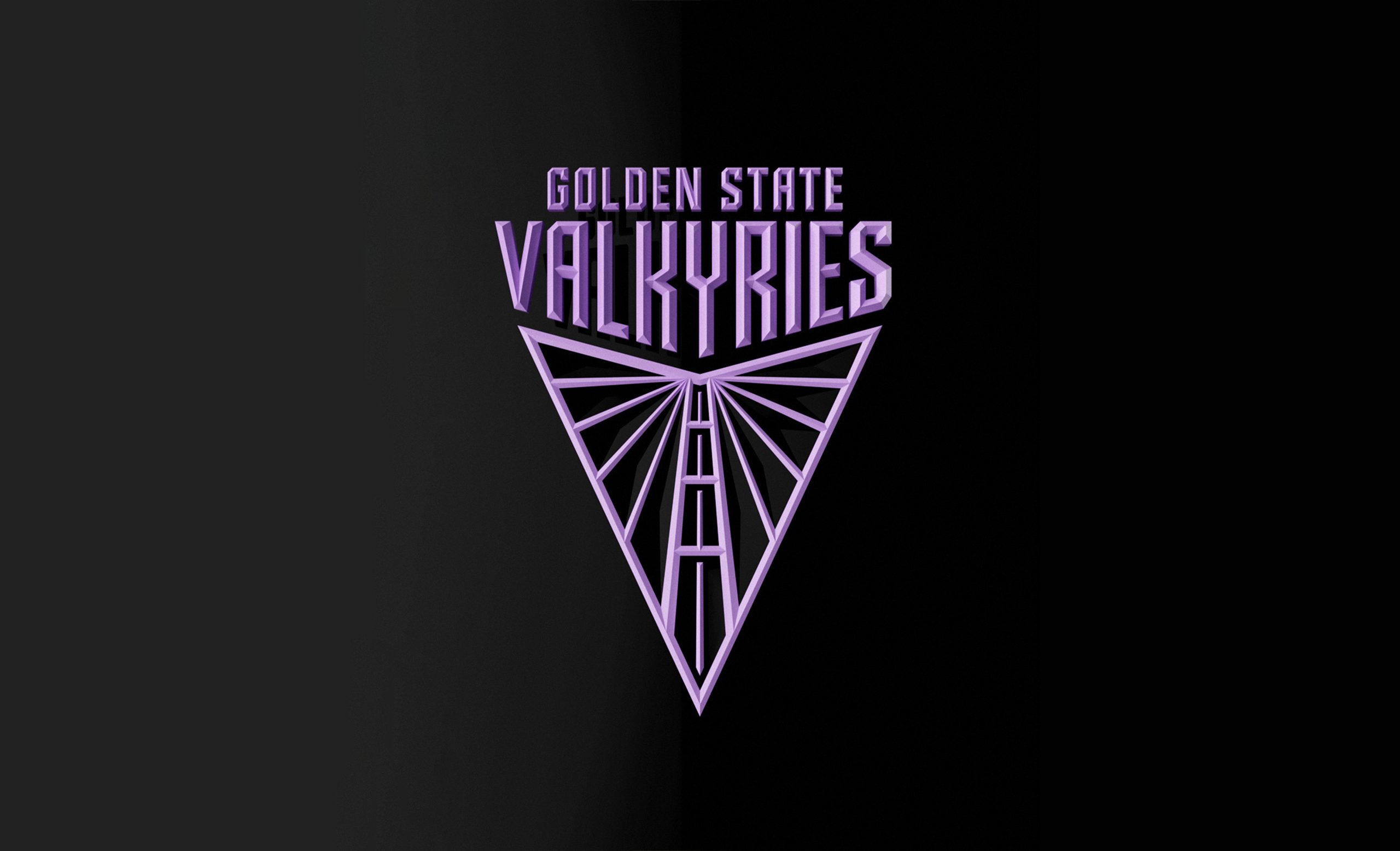
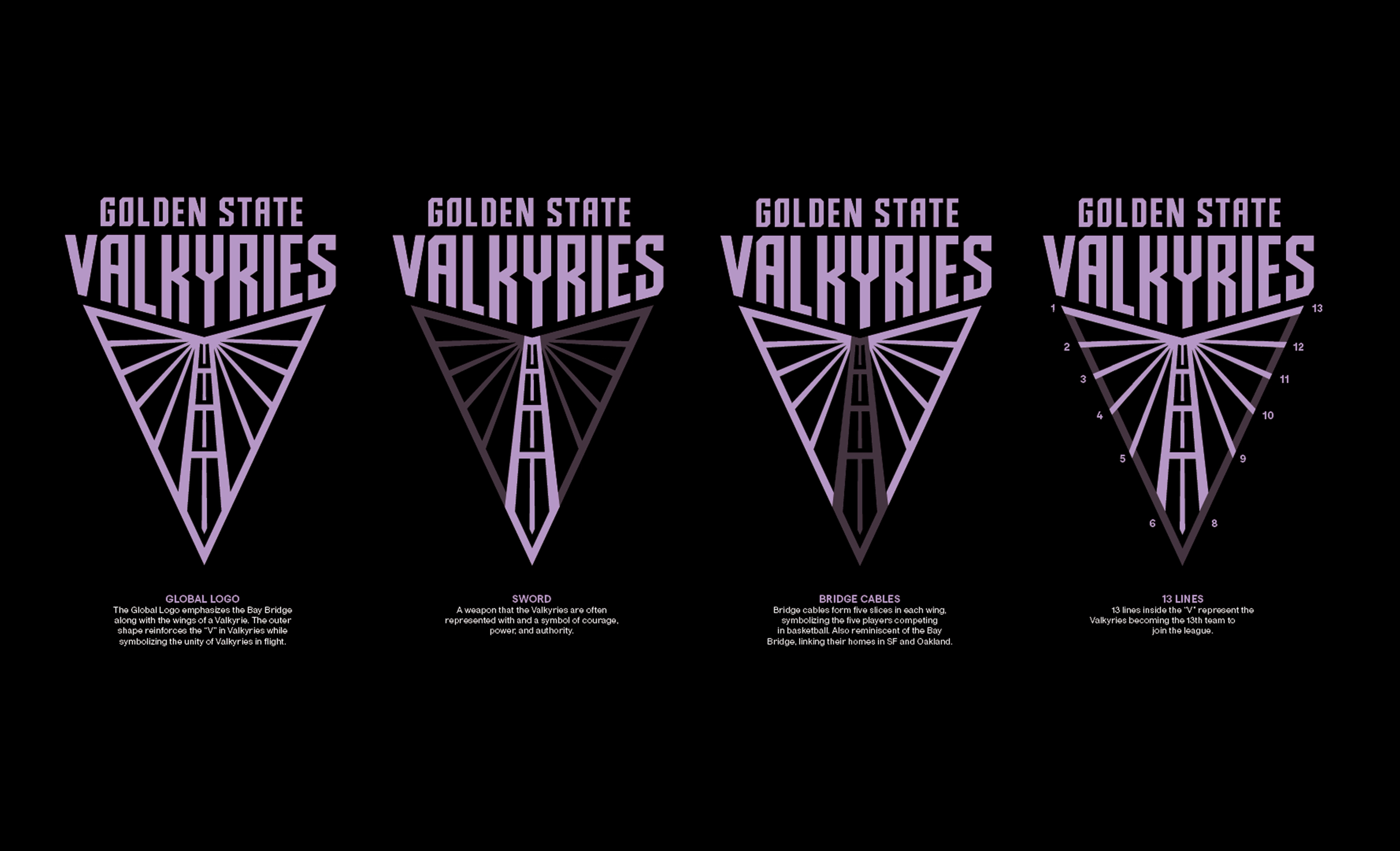
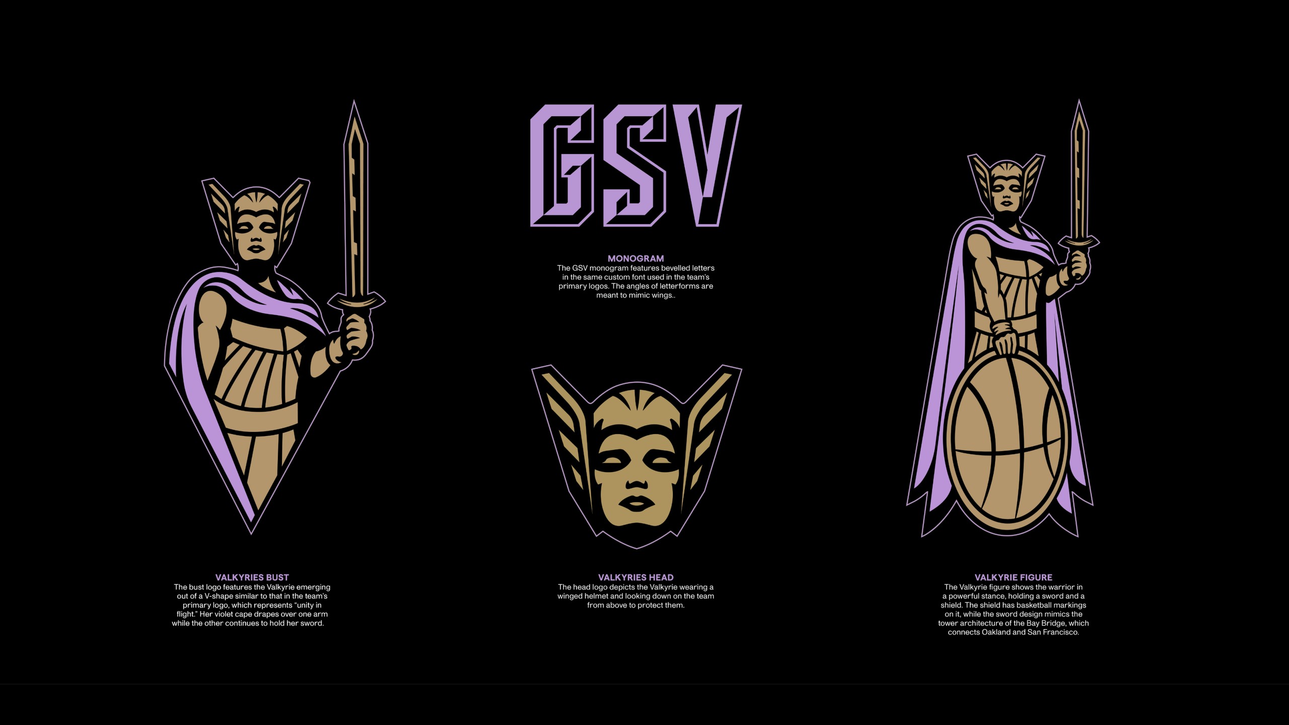
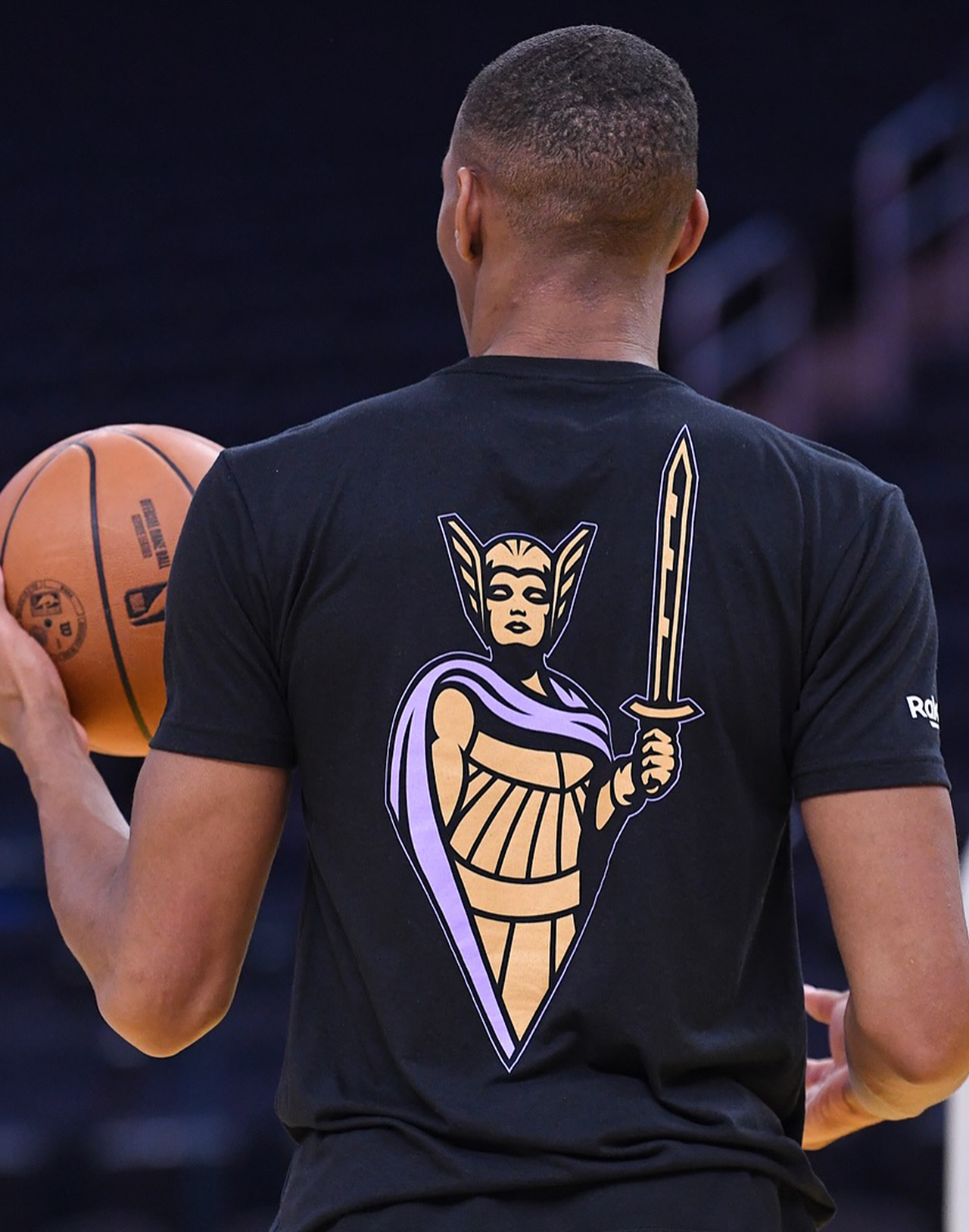
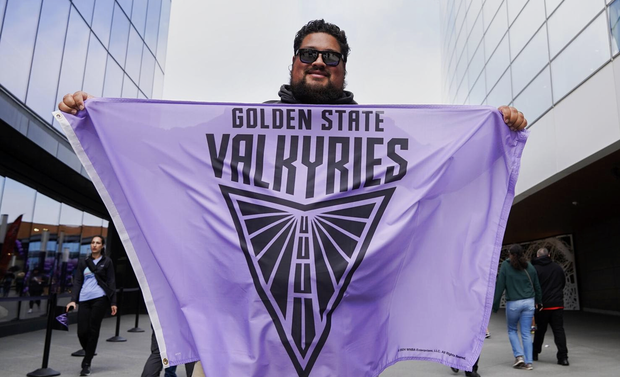
Our identity work responded to that ambition. We distilled a primary “V” mark shaped by the Bay Bridge — its tower doubling as a sword — blending mythology with geography. The brand palette centers on Valkyrie Violet, balanced with black, gold, and white to communicate strength, nobility, and modernity. Alternate logos bring motion and posture, wing motifs, and armor references; secondary iconography includes shield and sword elements as a nod to Norse warrior lore. The system stretches from uniforms to merchandise to digital, carrying forward a narrative of women in motion, rooted in place, ready to lead.