Milwaukee Bucks
Project Information
When new ownership demanded a clean break from the Bucks’ red-and-green identity, D&C plunged headlong into a high-stakes redesign on a compressed timeline. With barely six weeks to land the new direction in time for NBA approval, the team worked around the clock. The pressure was real: the past identity felt diluted, over-stylized, and disconnected — it had drifted from the city it represented.
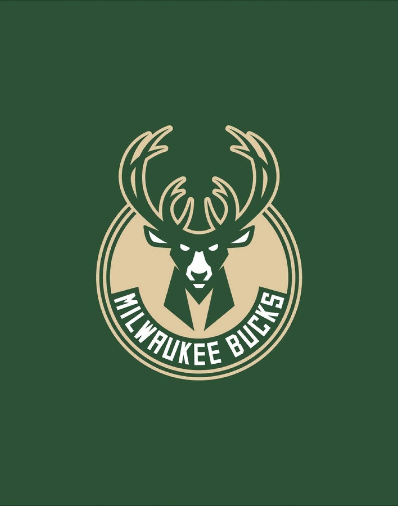
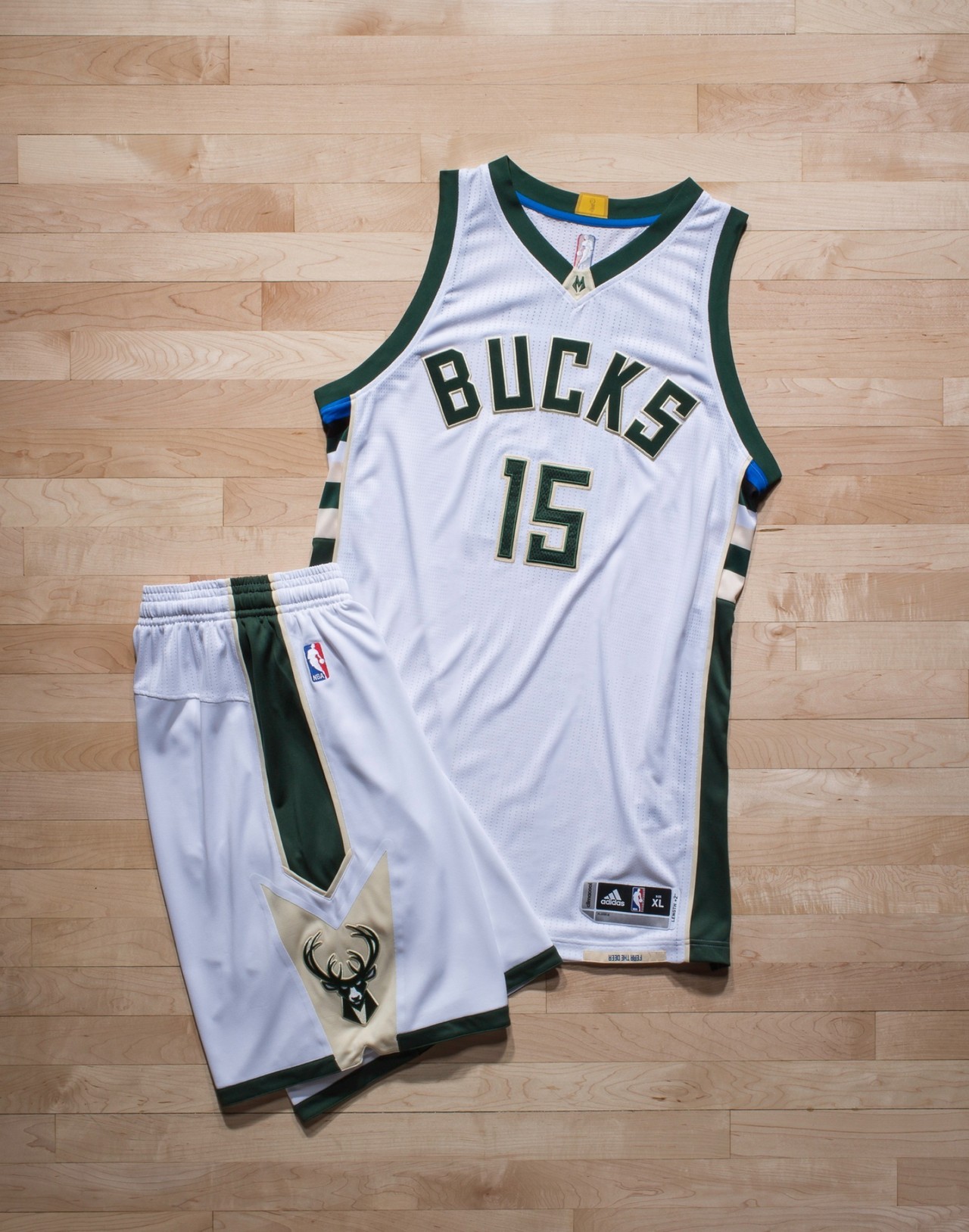
In that crucible, every choice became symbolic. The deer, once meek and decorative, was recast as a focused, forward-looking emblem — antlers now shape forms an “M” for Milwaukee. The palette dropped red, kept green, and introduced cream (a nod to Milwaukee’s “Cream City” bricks) and blue (a connective gesture to Great Lakes water). Despite tight NBA dye-restrictions limiting ideal greens or blues, the team pushed through to preserve meaning over ease. The logos now tell multiple stories: of place, pride, and transformation — every stroke aligned with the narrative of a franchise that’s not just rebranding, but recommitting.

Rooted in tradition, driven by the future — the Milwaukee Bucks’ identity is a bold tribute to the city’s heritage and a fierce declaration of where we’re headed.
Alex Lasry, VP