Utah
Mammoth
Services
Project Information
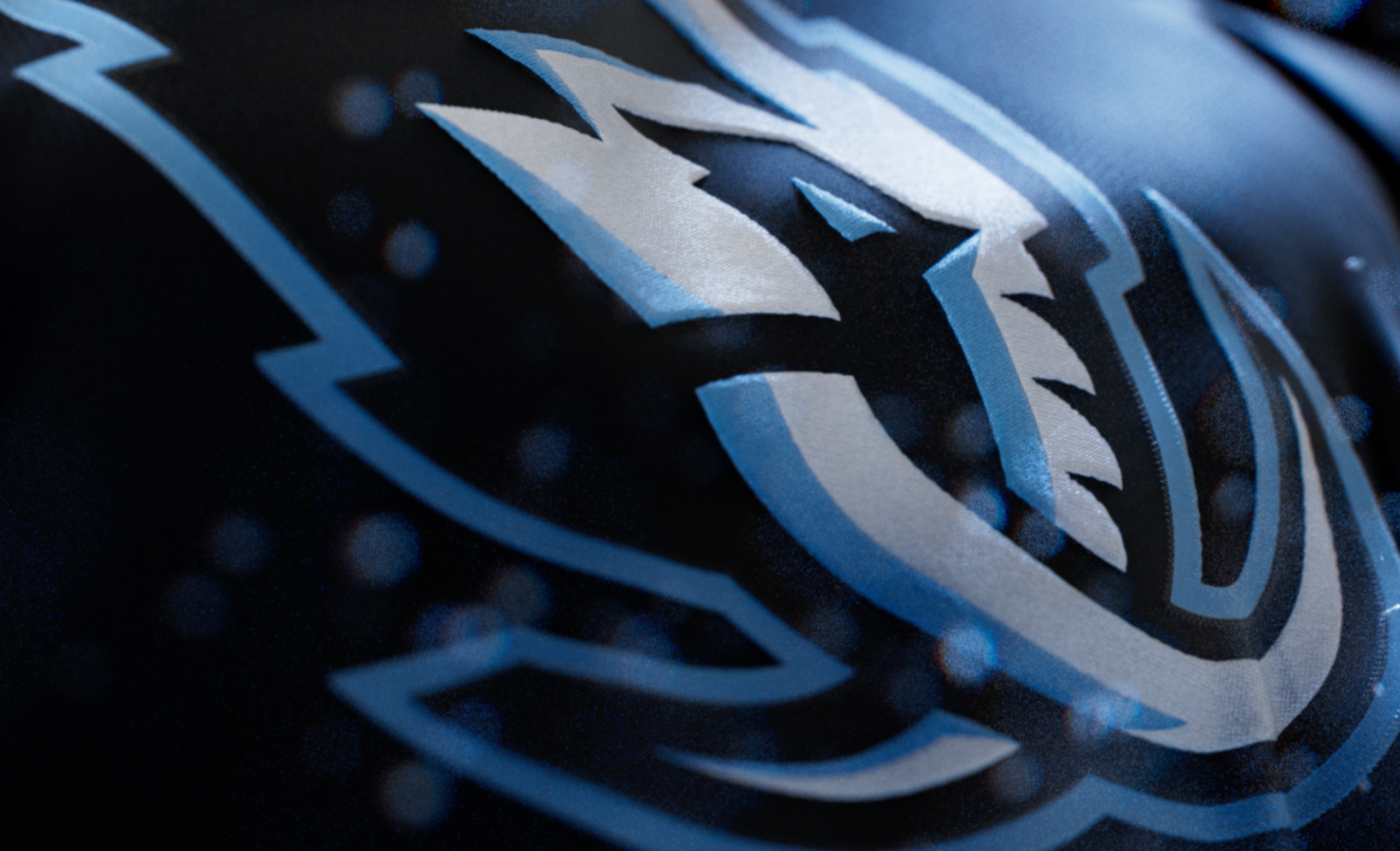
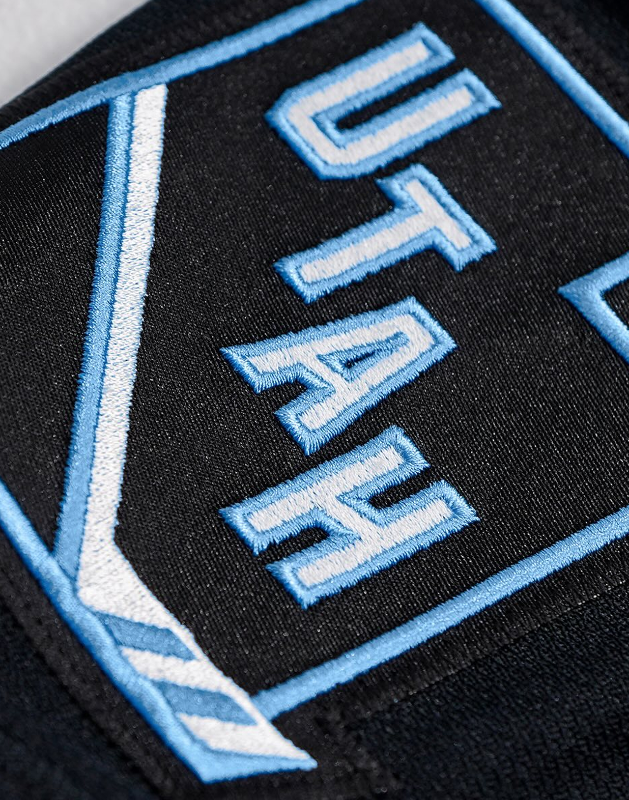
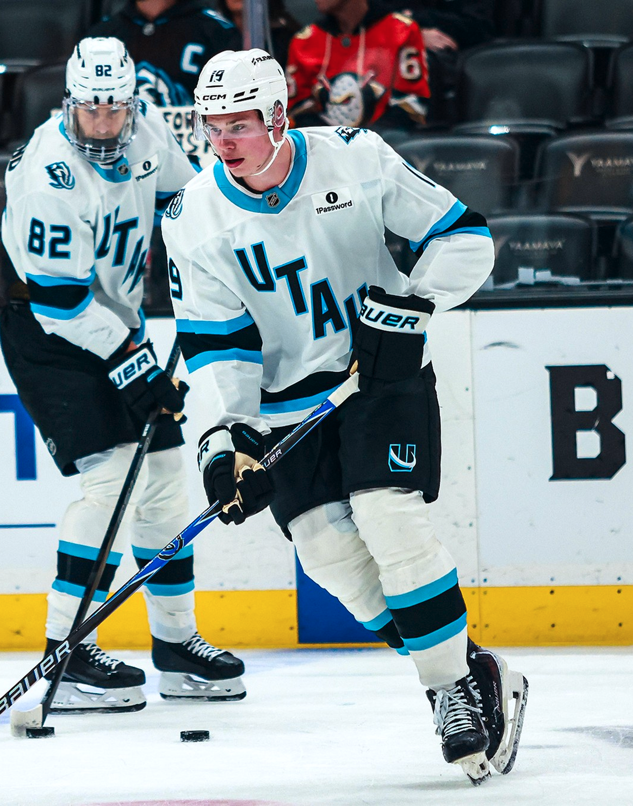
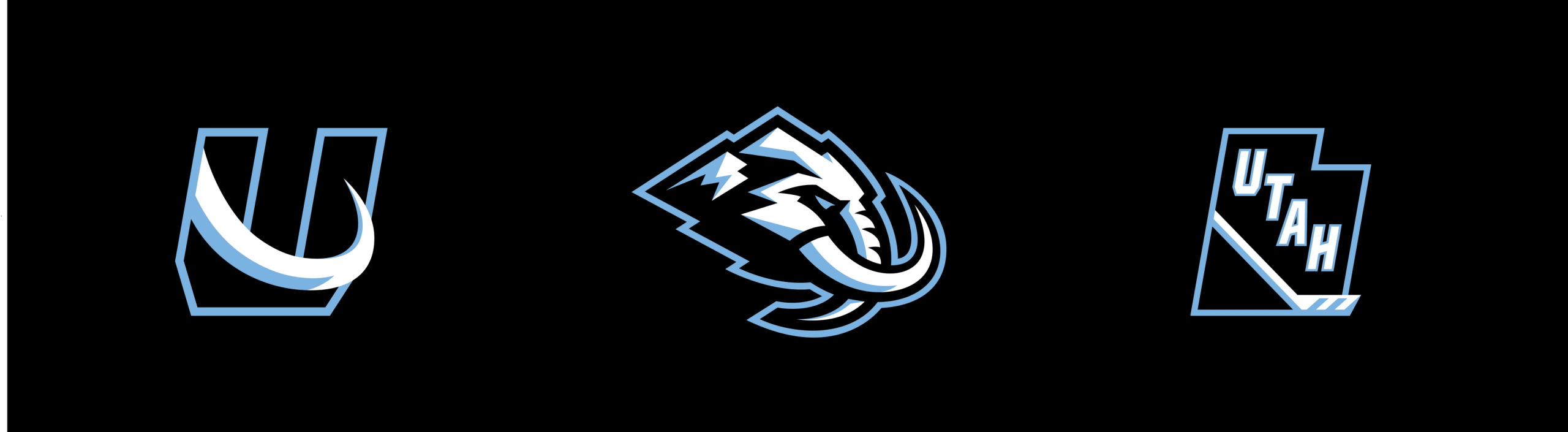
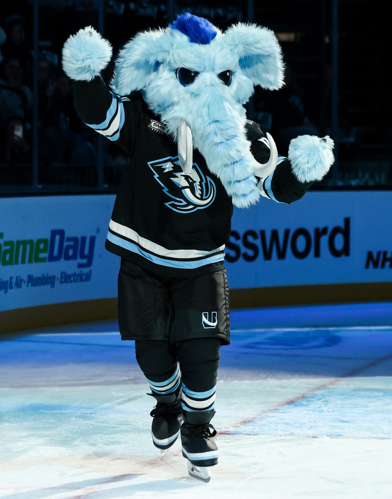
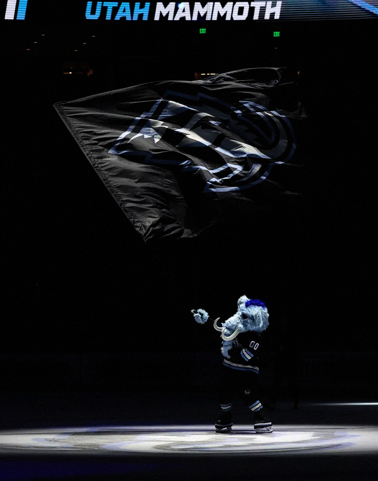
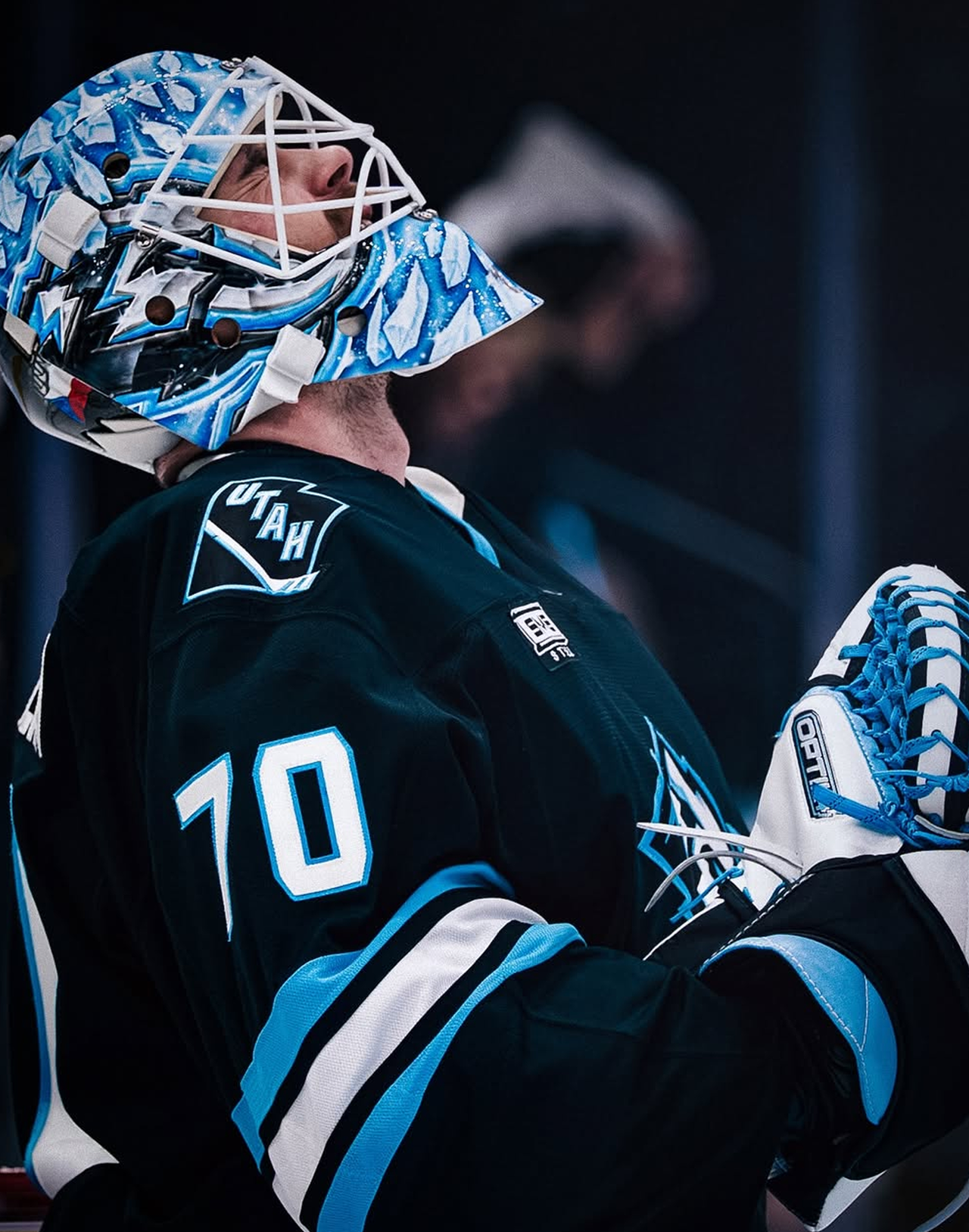
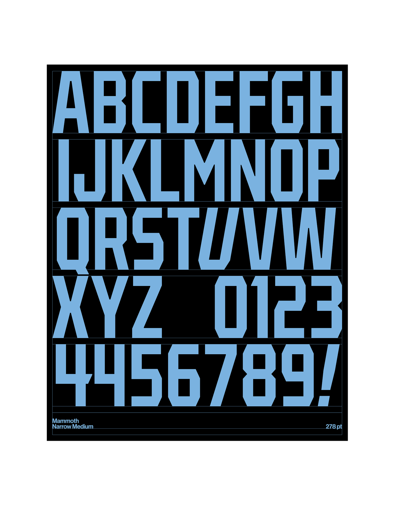
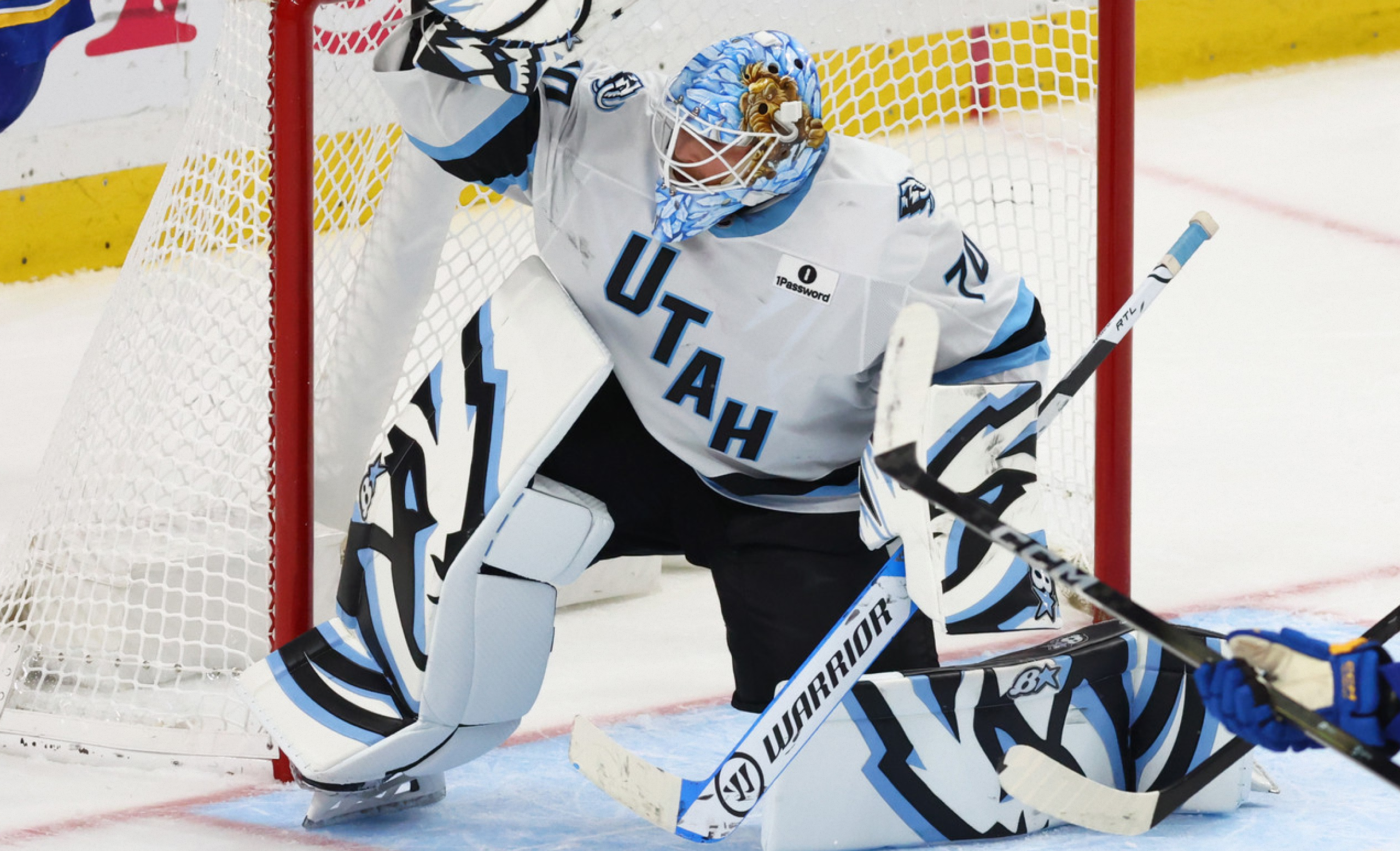
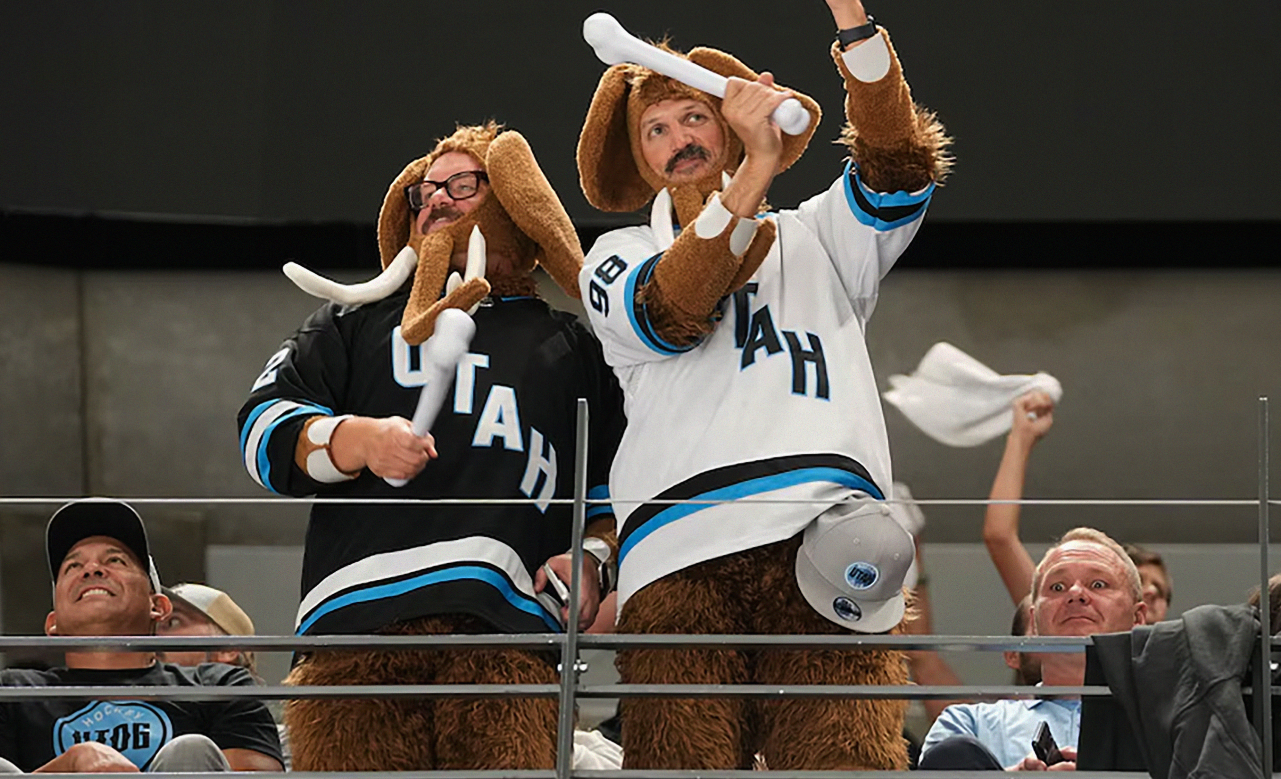
When the NHL’s newest franchise landed in Utah, it carried more than hope — it carried expectation. The team skated through its first season under a placeholder name while a permanent identity was forged. Over 13 months and four rounds of fan voting, more than 850,000 voices helped shape the result: the Utah Mammoth. We built an identity rooted in place and powered by community — from the “Mountain Mammoth” mark, with its layered peaks, tusk-turned-U, and hidden outline of the state, to a custom Mammoth Sans typeface designed for the ice. The system stretched across jerseys, alternates, and wordmarks, balancing Rock Black and Salt White with Mountain Blue accents, and extending into patches, signage, digital, and apparel.
On May 7, 2025, the Mammoth were officially unveiled — a name chosen by fans and a design praised for its bold clarity and depth. Media called the uniforms some of the strongest in the league; supporters embraced the story of a brand drawn from Utah’s Ice Age past and built for its hockey future. By keeping core colors intact, merchandising rolled out seamlessly, and the team entered its new era with a system ready for arenas, broadcasts, and fan culture alike. More than a logo, Mammoth is a narrative: a franchise with roots, ambition, and a visual identity built to last.