Movement
Festival
Project Information
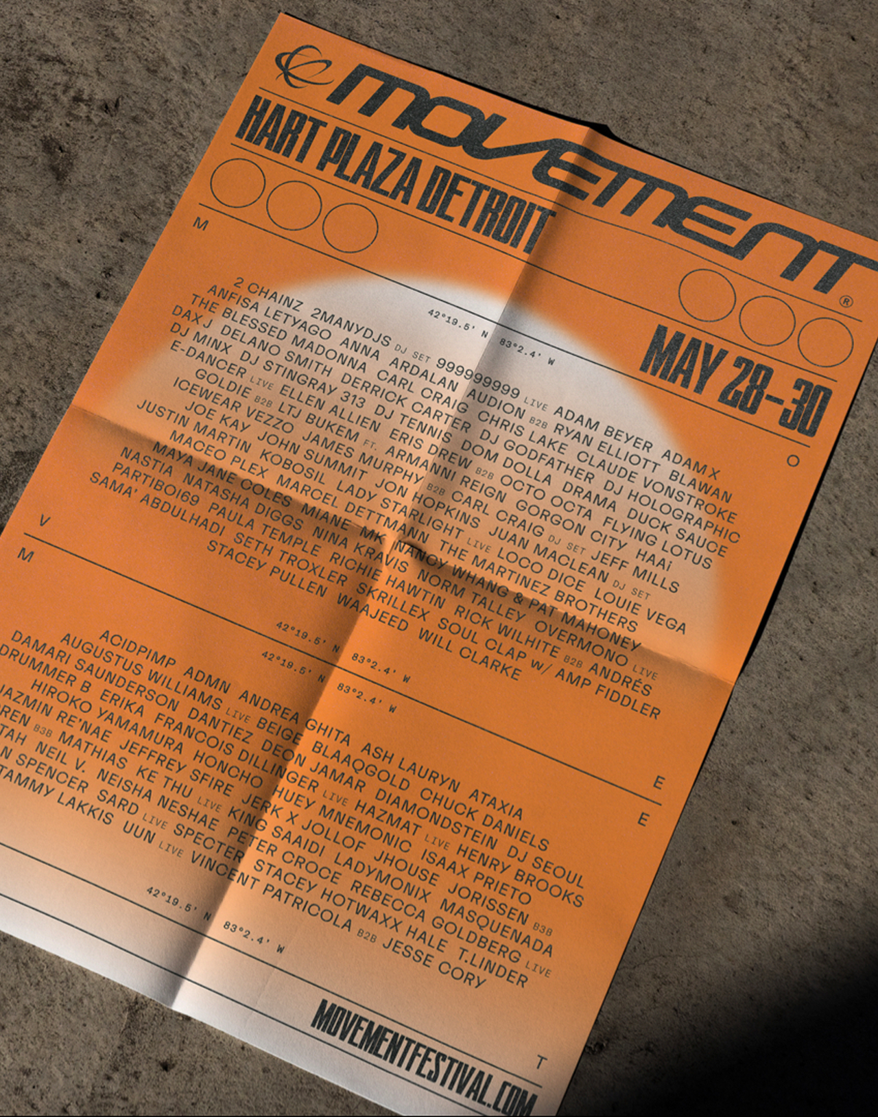
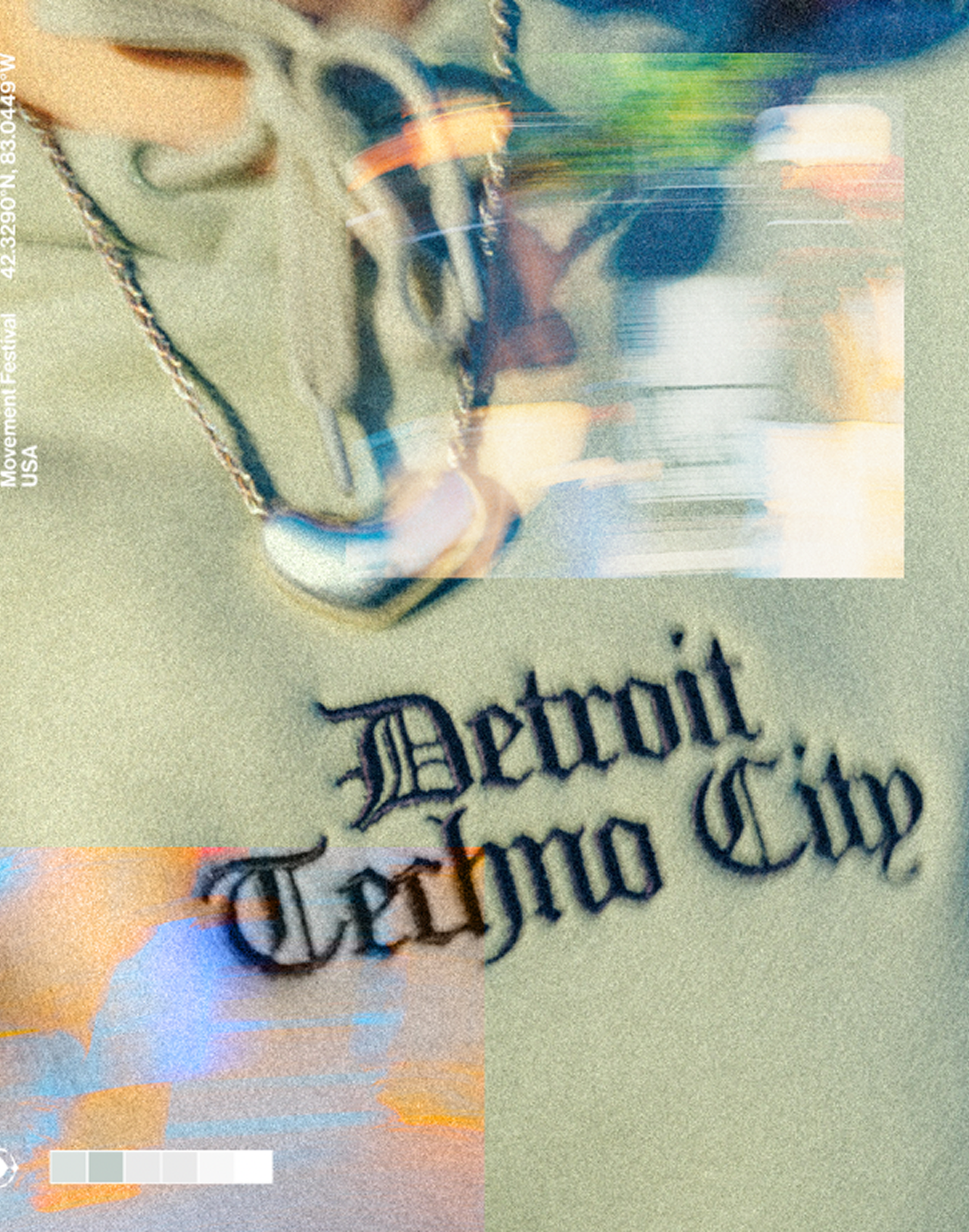
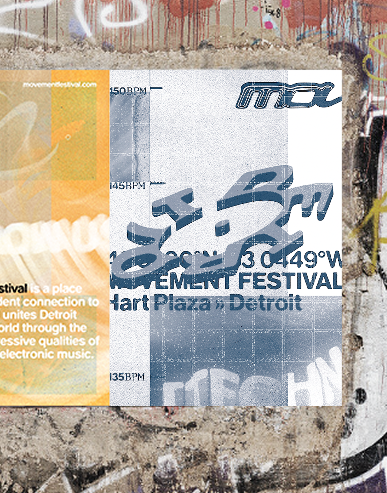
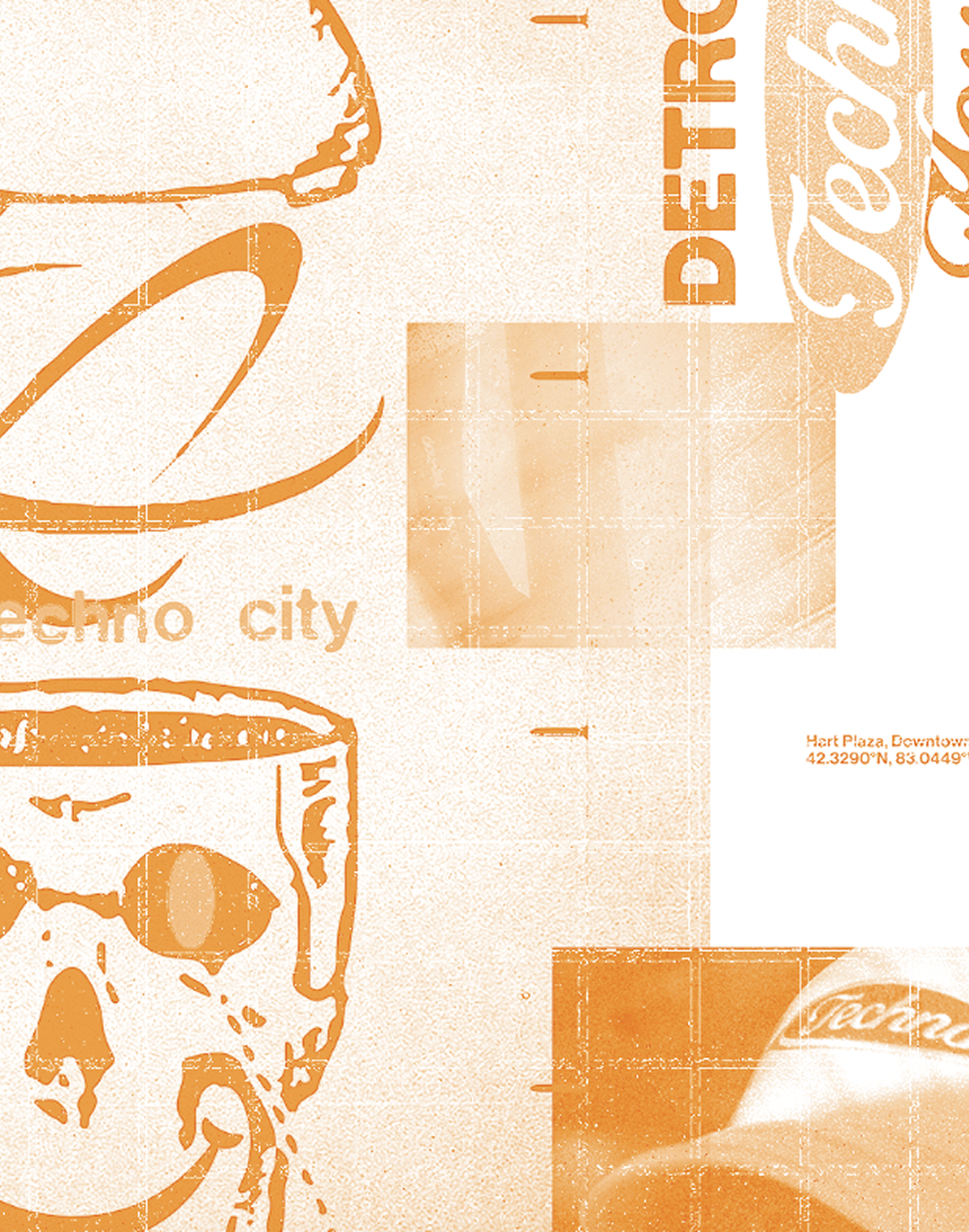
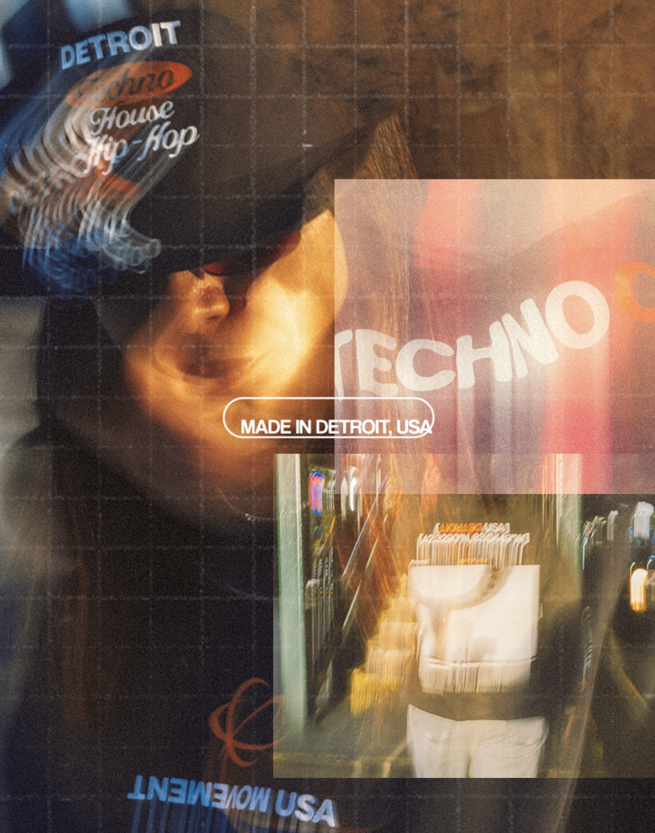
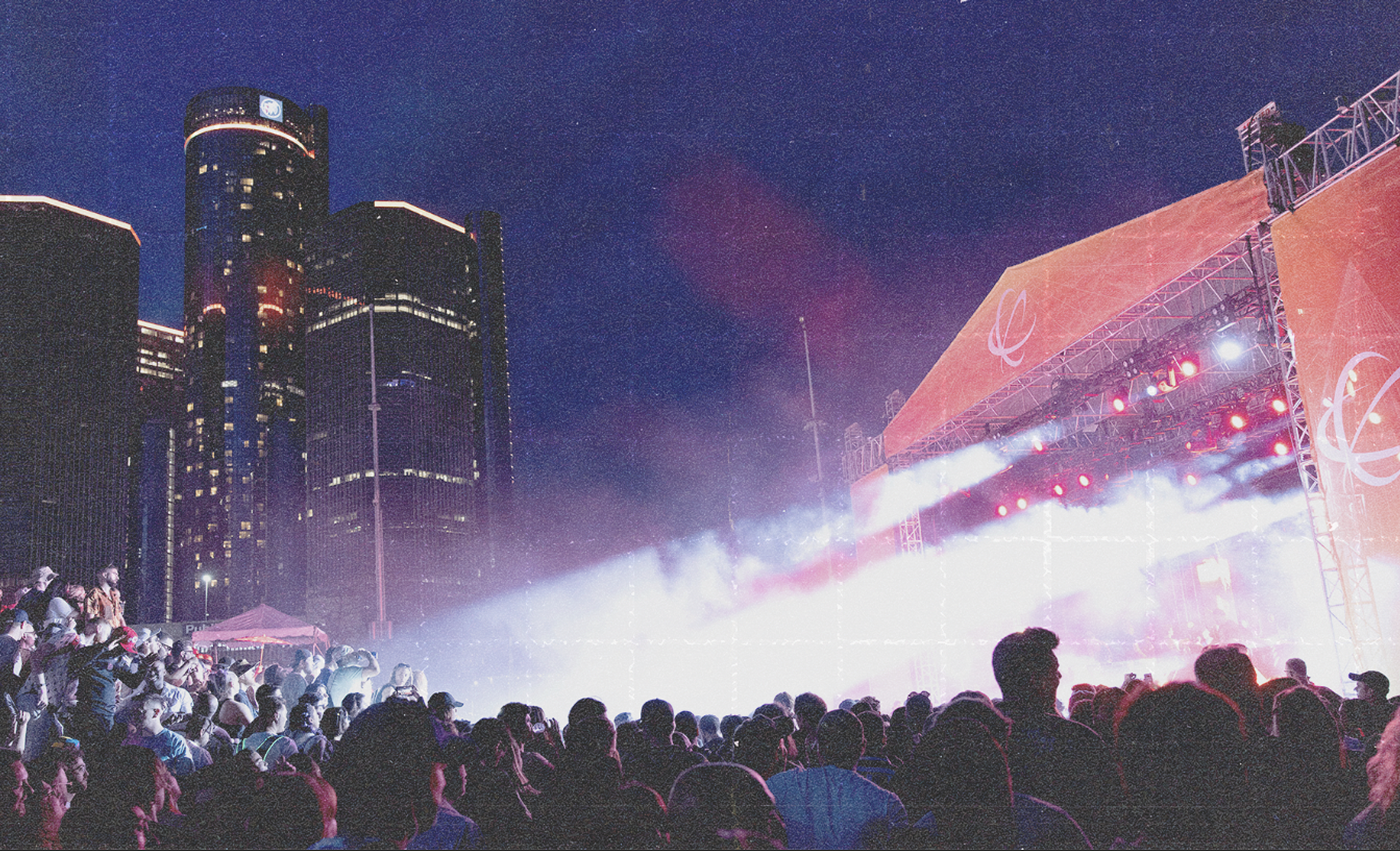
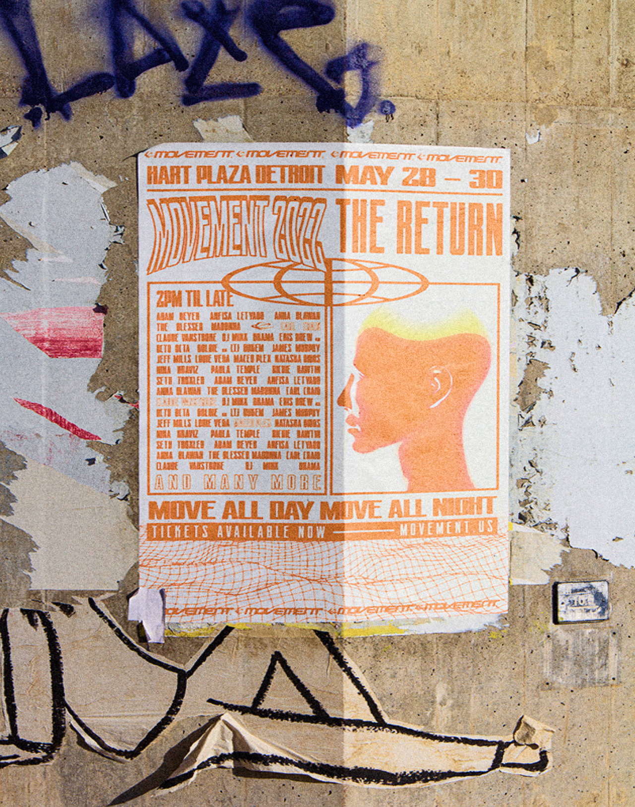
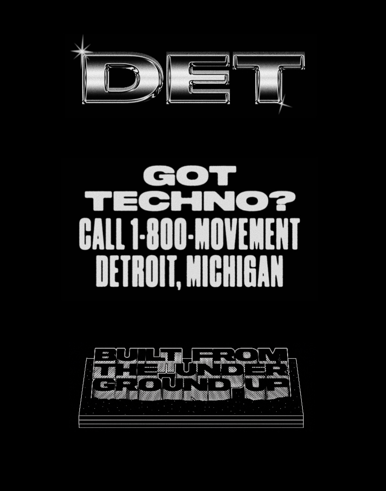
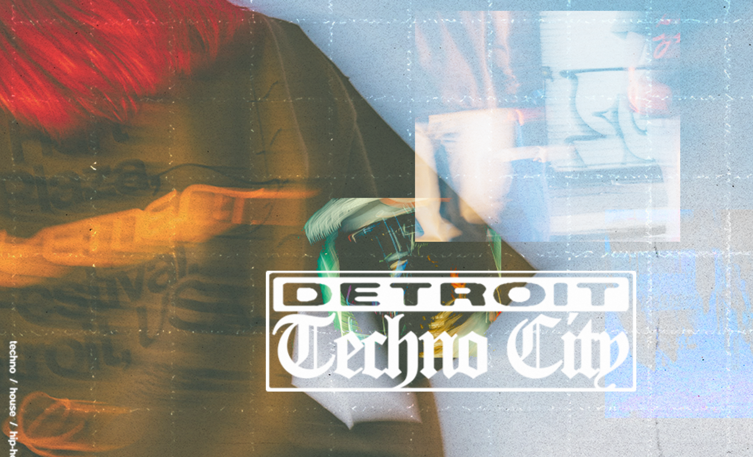
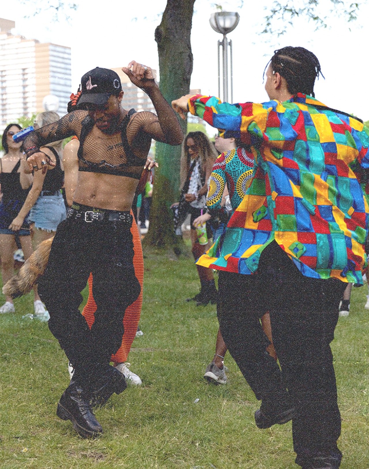
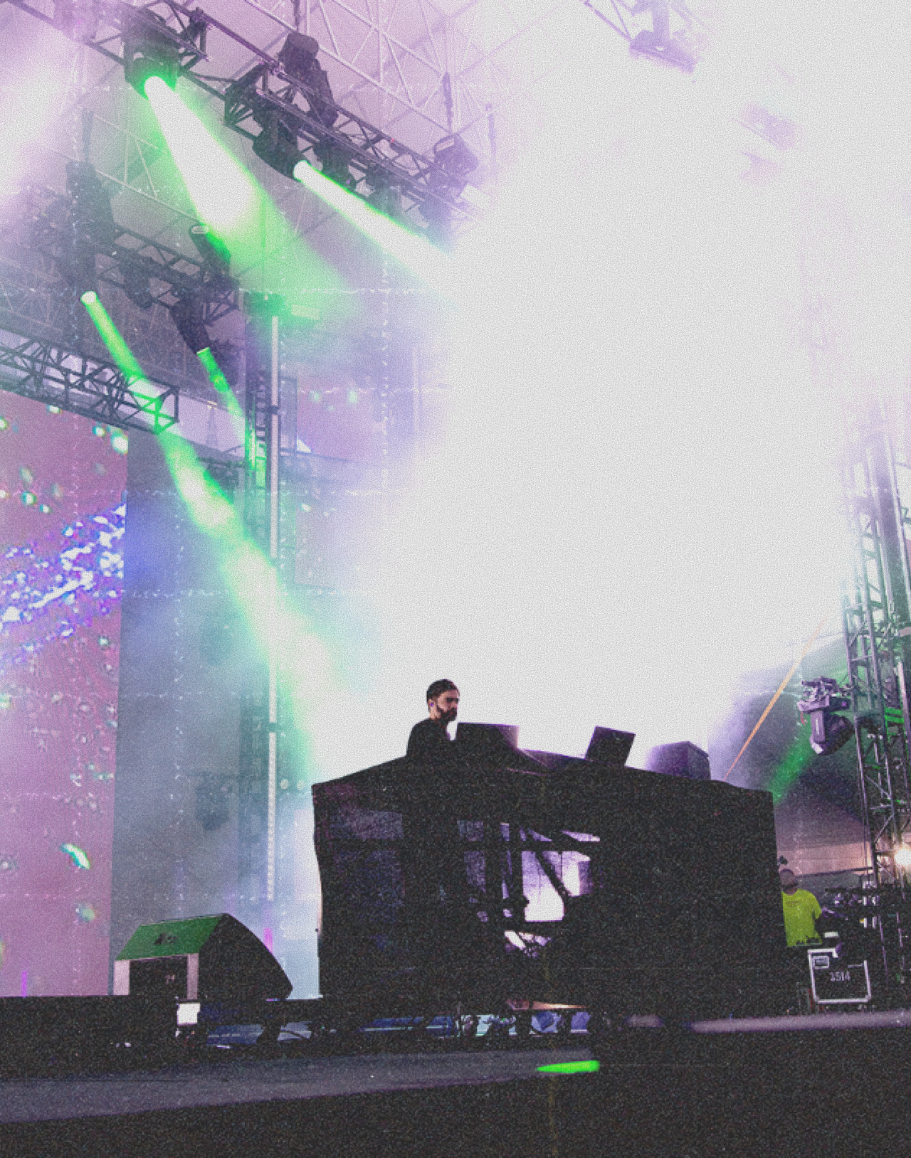
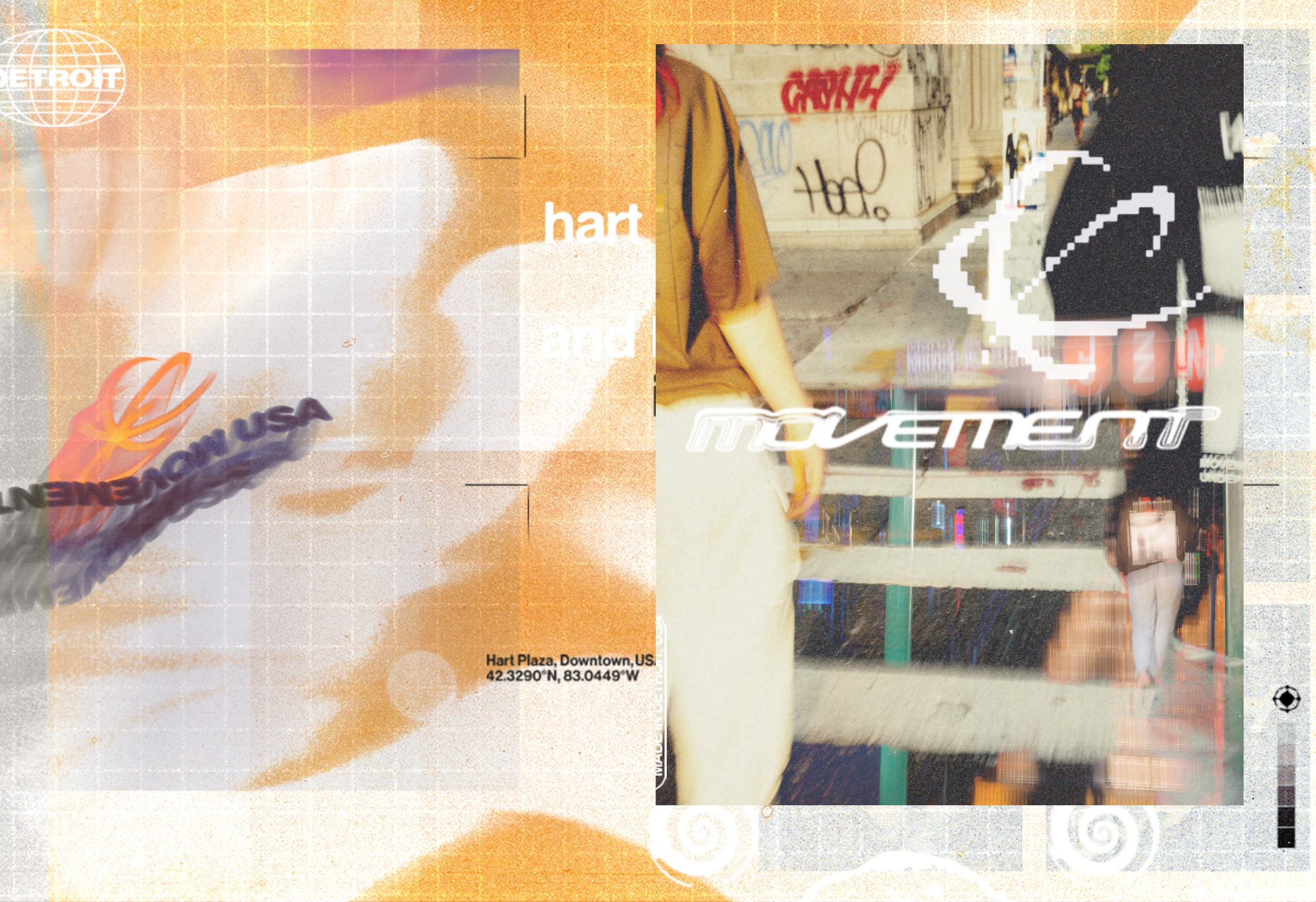
Detroit is more than a backdrop — it’s the pulse. At Movement, every beat, every rupture, every silence carries the city’s industrial bones, its post-boom grit, and its techno soul. When we took on the rebrand, we didn’t just design a logo. We built a system that stretches across bodies, buildings, and sound waves—claiming space the way Detroit always has.
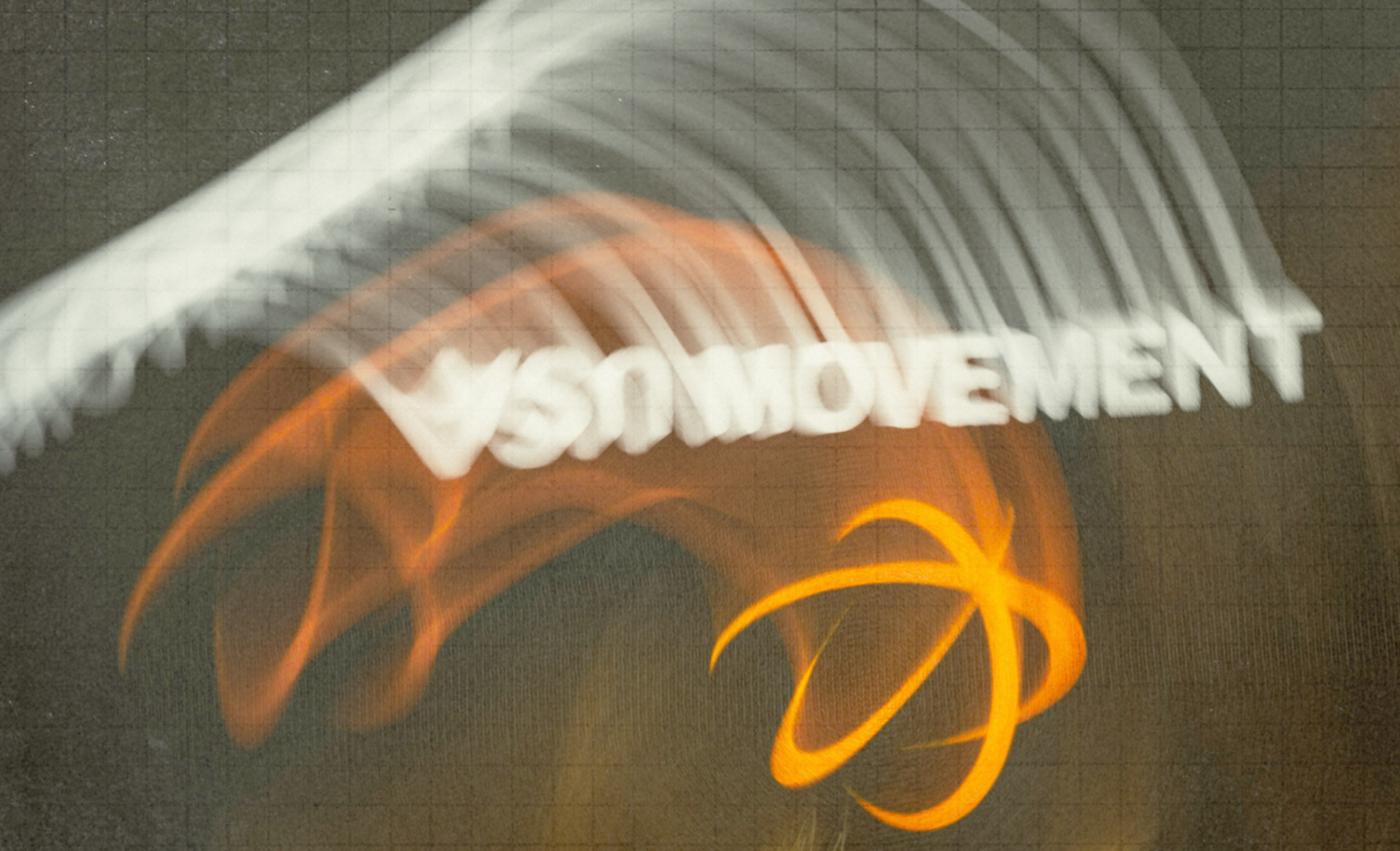
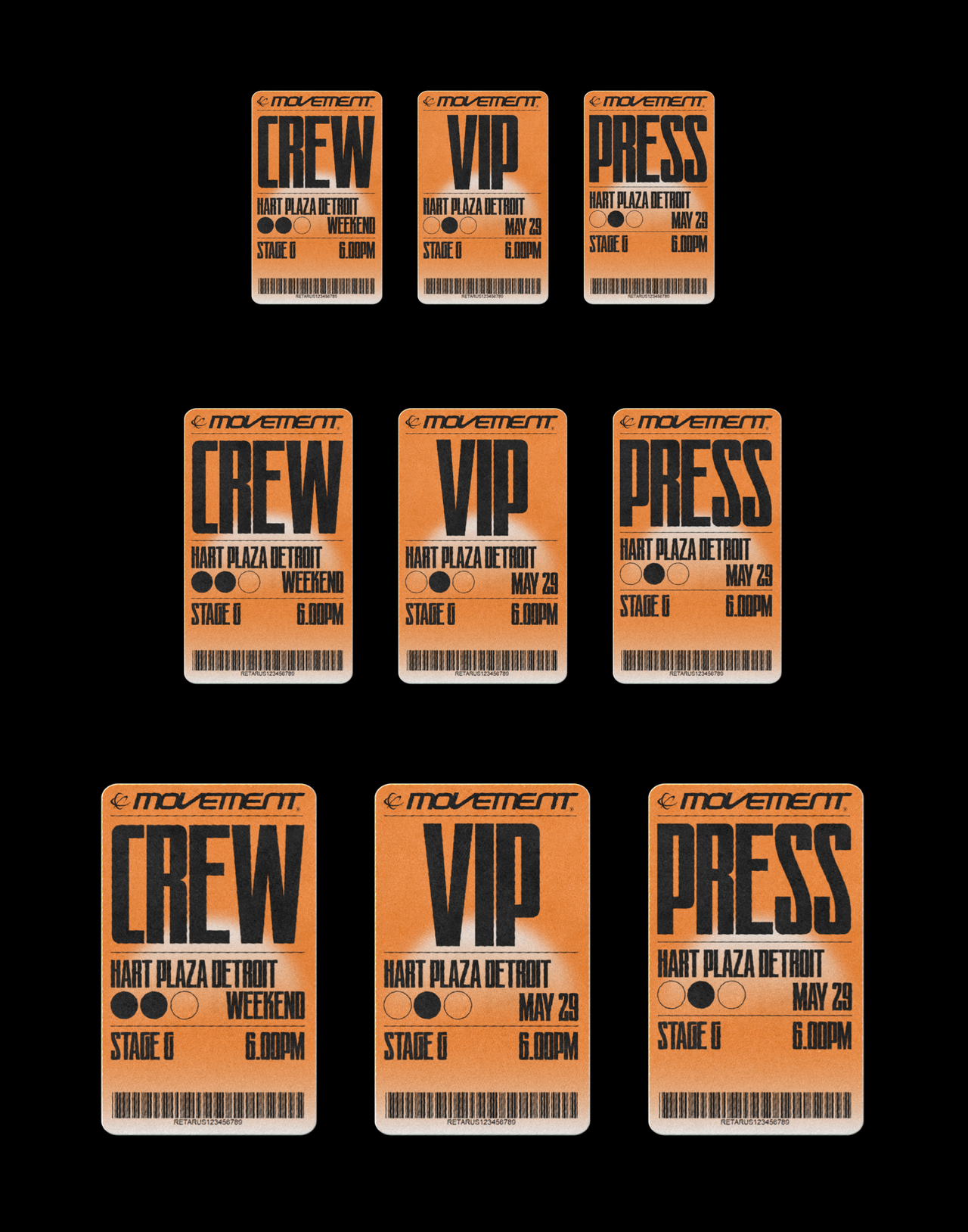
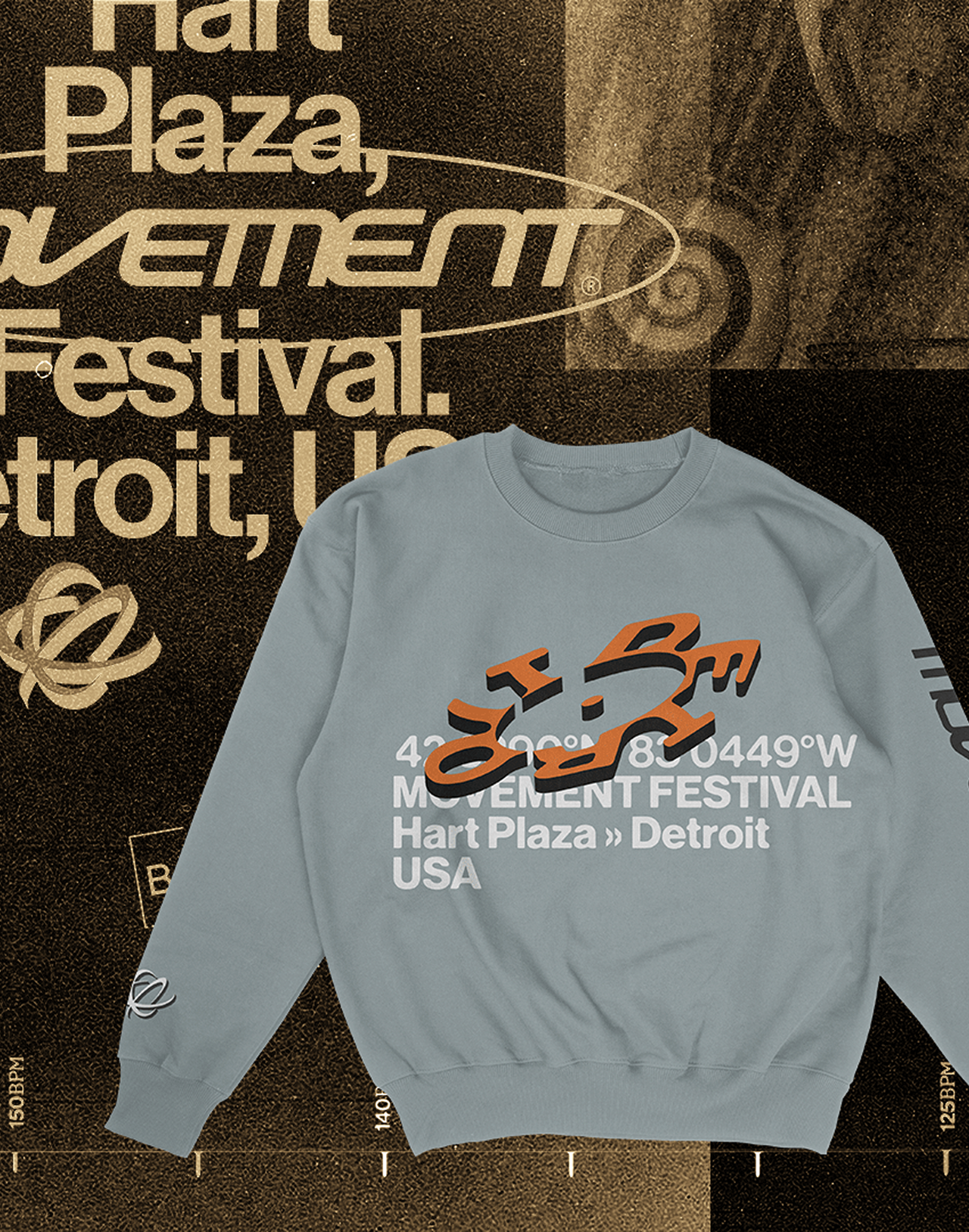
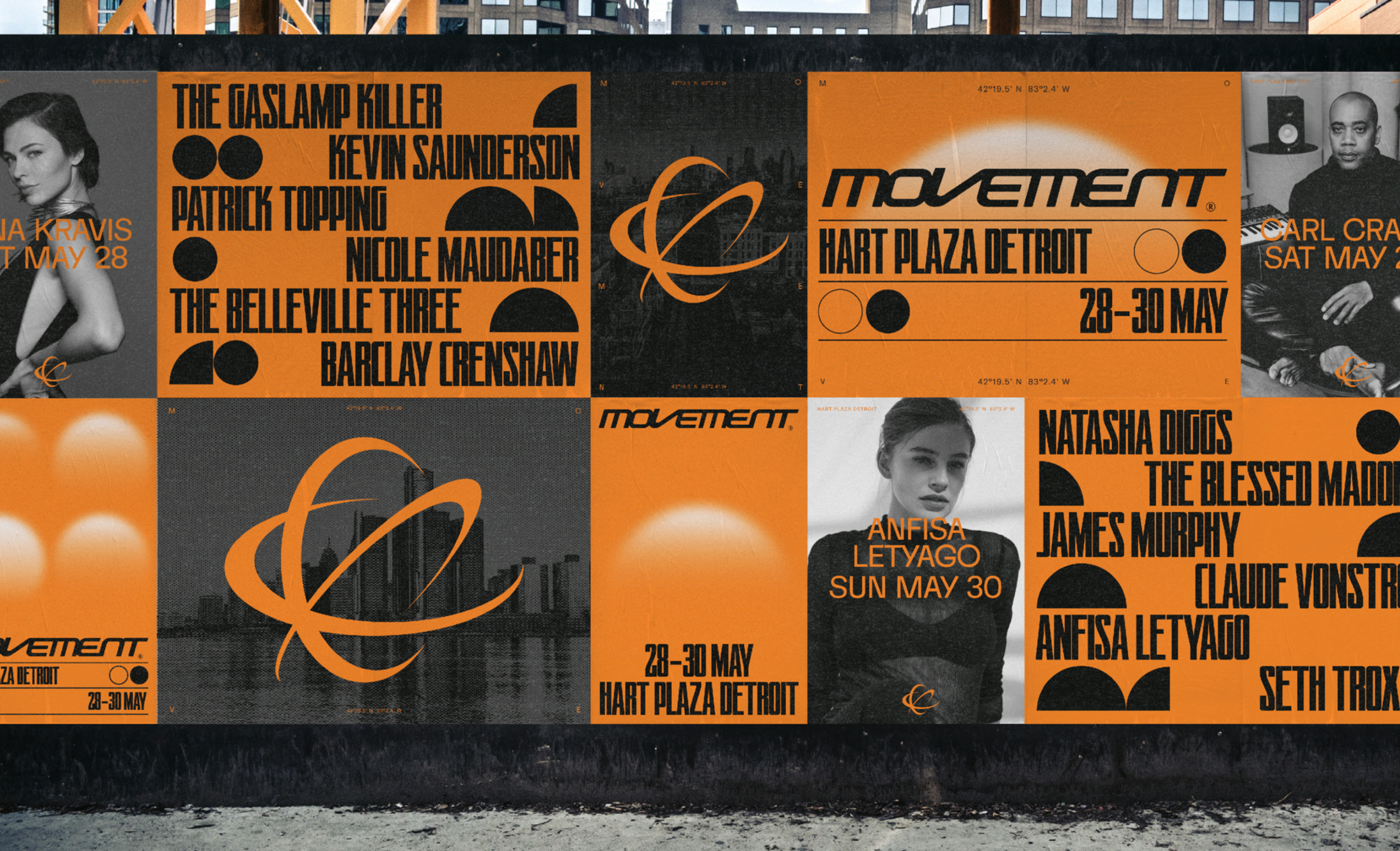
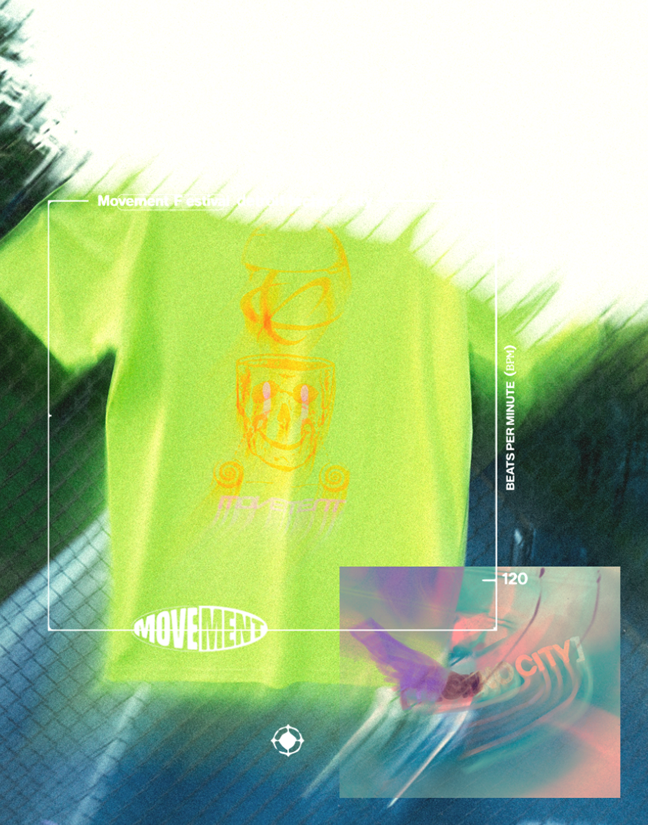
The “M” monogram is the fulcrum—a modular track-oval twisted into letters, fractured and stretched into patterns that morph across hoodies, walls, stages, portals. It became architecture, wearable skin, and kinetic texture. Typeface, color, motion—they’re all collaborators in this system, not afterthoughts. On site, the identity warps across stage sets, explodes across banners, pulses in lighting. In apparel, it folds, shifts, lives. In digital, it collides and breathes. That’s how movement becomes identity—and identity becomes Movement.