New York
Athletics
Project Information
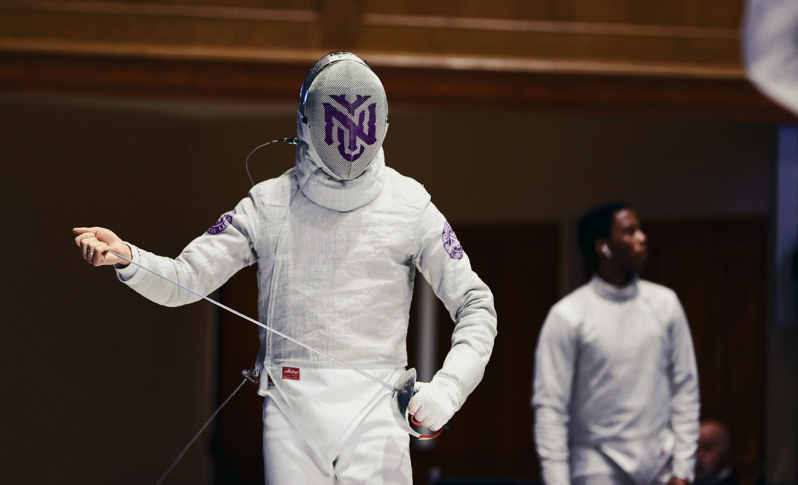
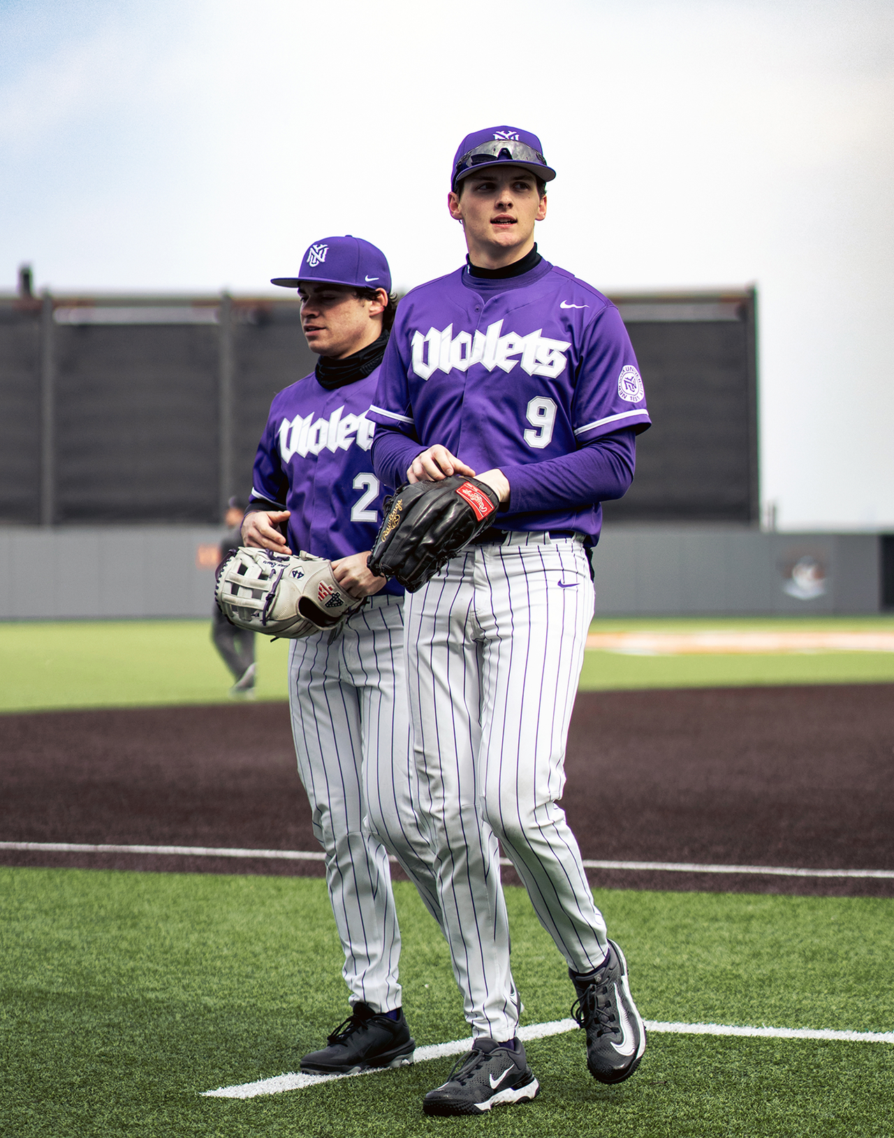
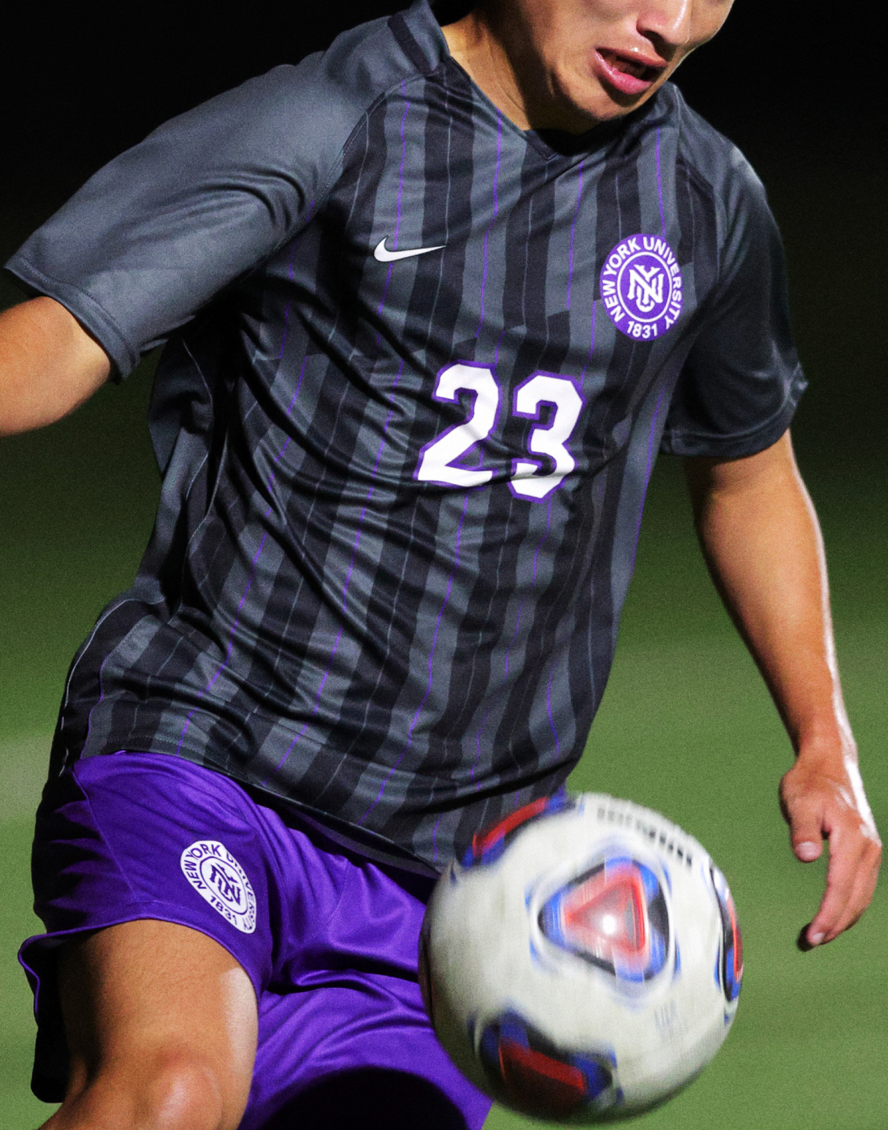
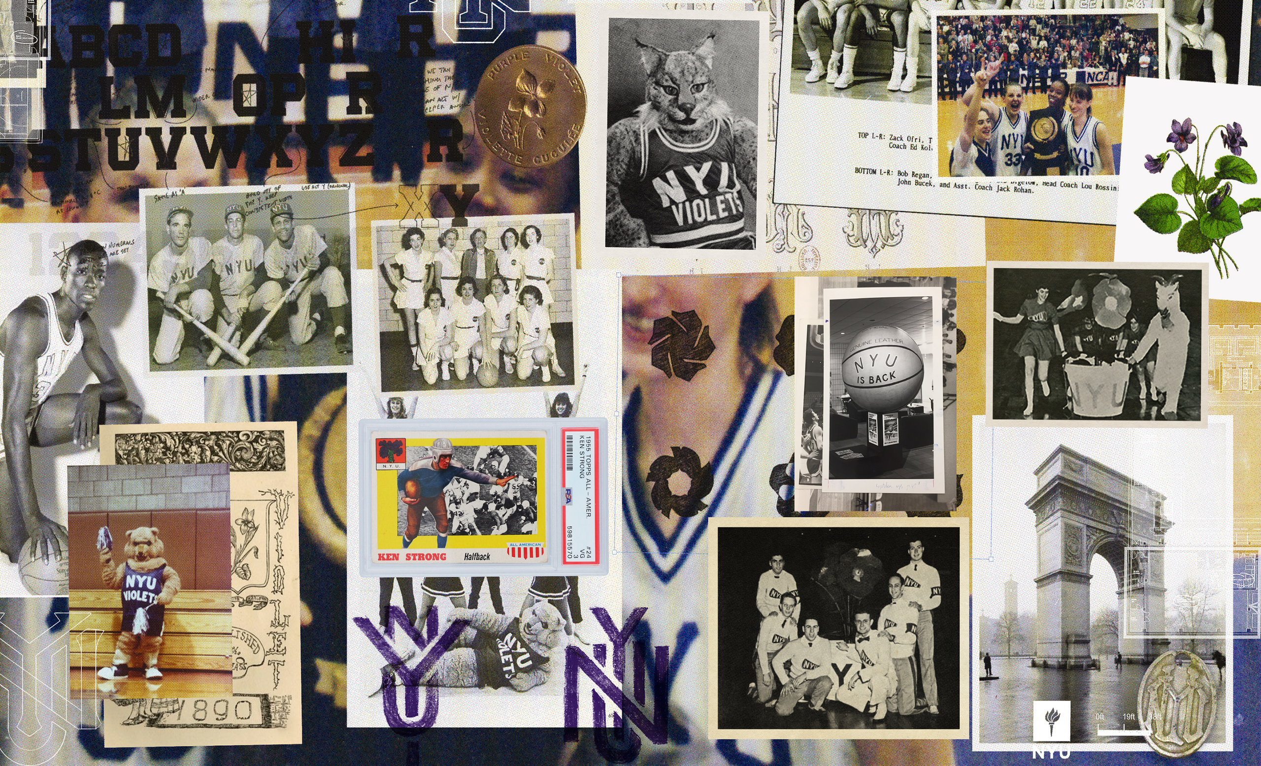
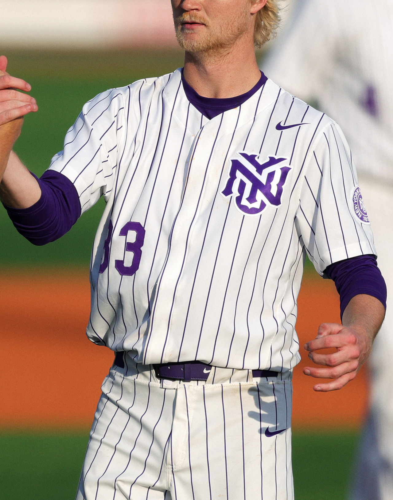
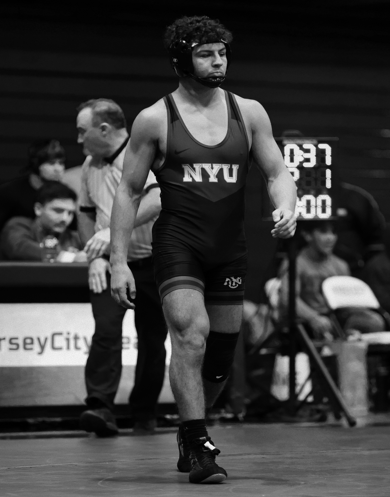
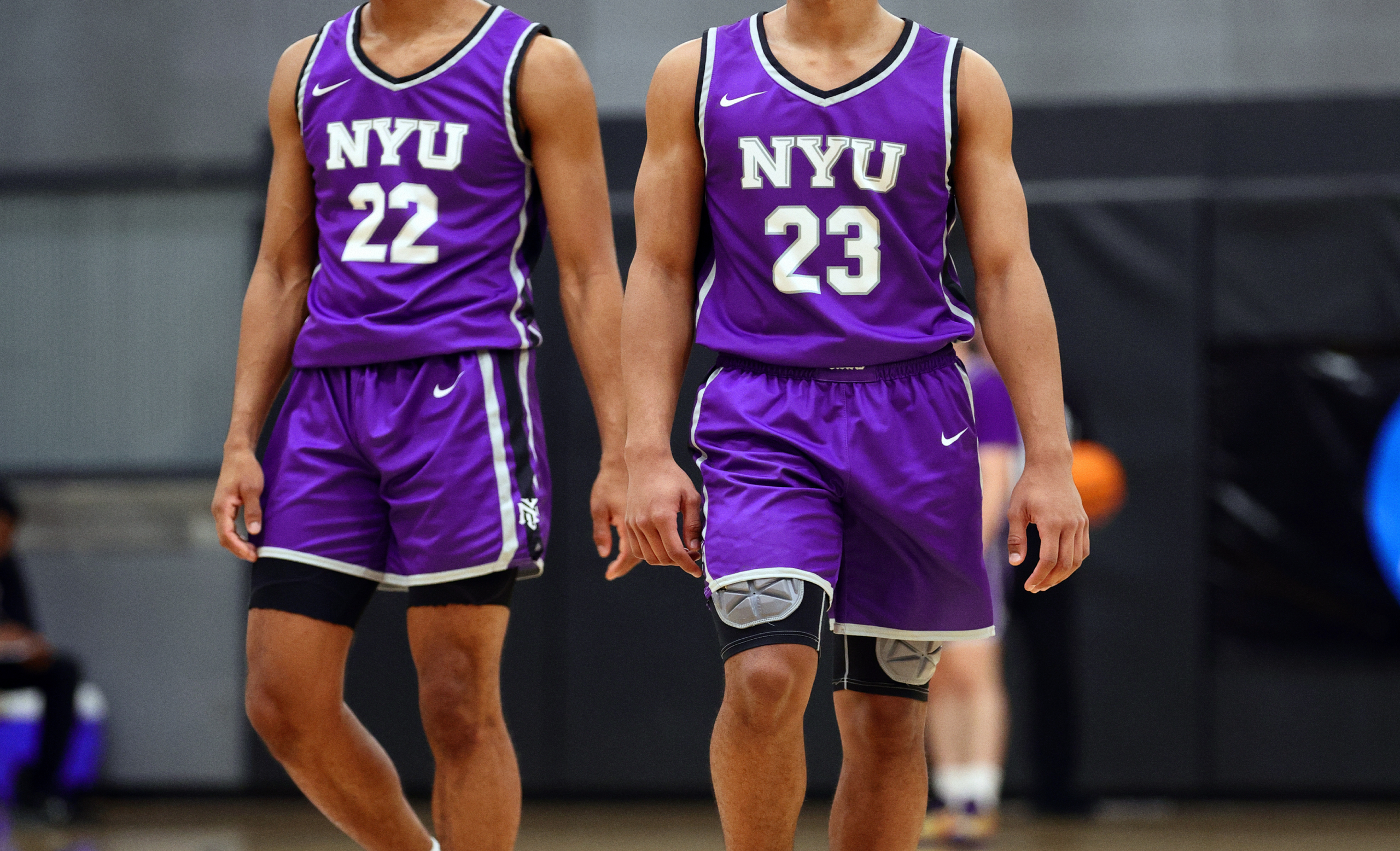
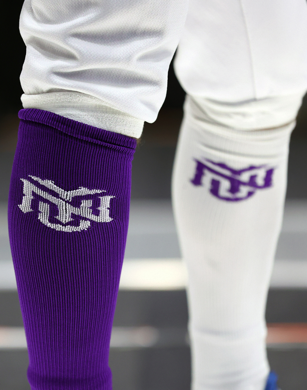
When NYU Athletics sought to relaunch their identity, the moment demanded more than a refresh — it needed clarity, pride, and voice worthy of the city and institution it represents. In the relaunch narrative, NYU claimed stake in its urban roots and athletic future: “The heart of this foundation lies in New York City.” As creative stewards, we partnered in defining how Violets move visually, conceptually, and emotionally, giving shape to a brand identity that’s as resolute in Greenwich Village as it is on the field.
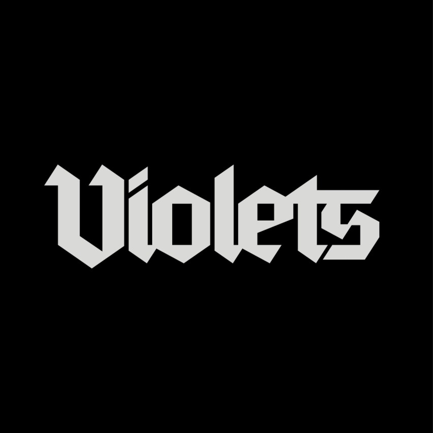
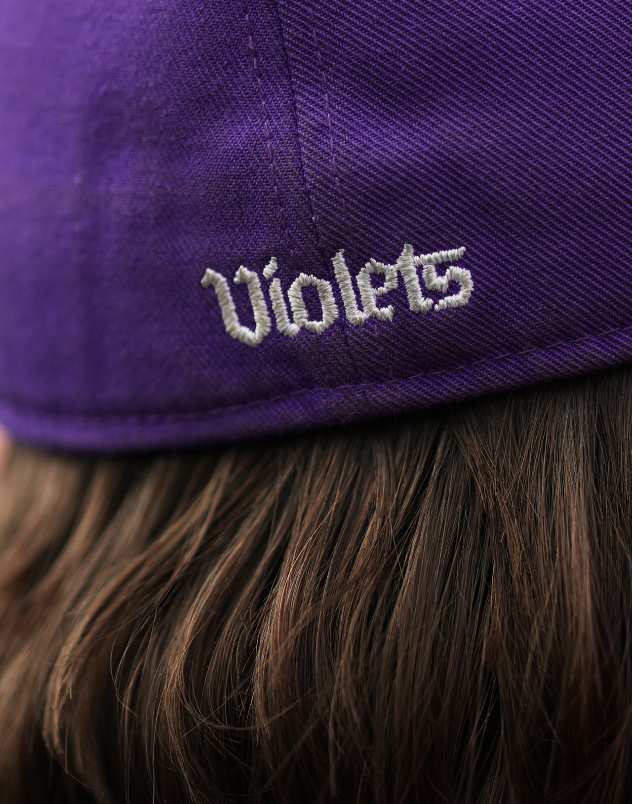
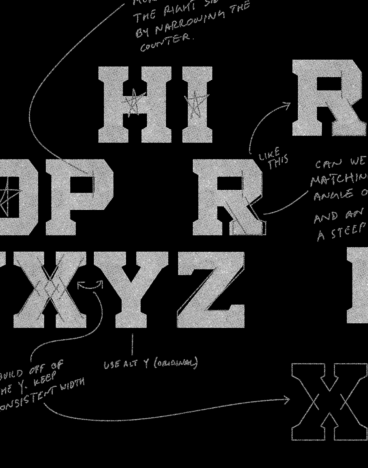
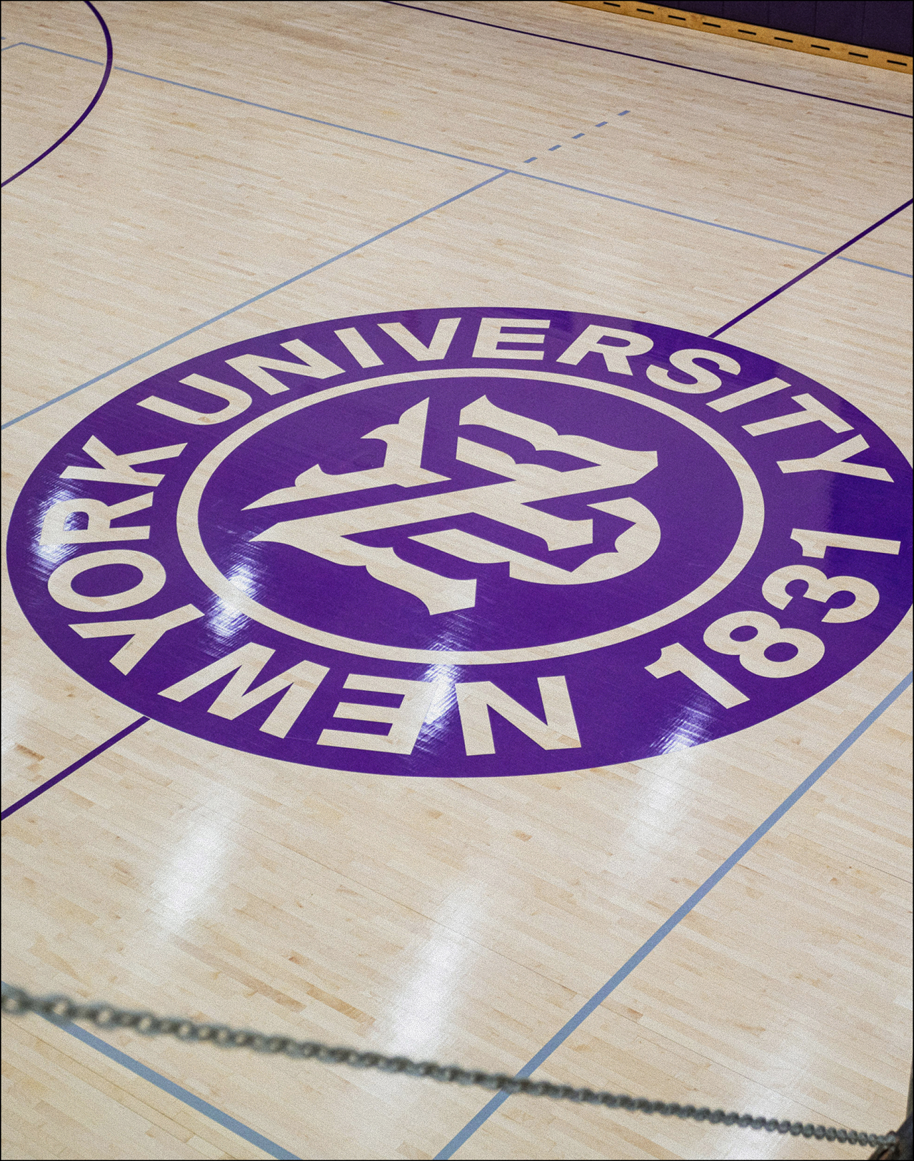
At the core of that evolution is the NYU Monogram — the anchor of the visual system, designed to operate at any scale across apparel, digital, signage — reinforced by a disciplined color palette (Violet, Silver, Grey, White) and modern typographic systems. Out of the mark and identity work arises cohesion: unified team marks, system rules, visual language that bridges varsity heritage and contemporary purpose. The relaunch launched more than graphics — it gave the Violets a renewed platform for storytelling, connection, and legacy across campus, broadcast, and community.